fraggle Posted January 12, 2014 I and others have been working on FreeDM recently, which has been in dire need of some work in order to give it a distinct identity separate from the main Freedoom one. One thing I'd really like to see is a separate logo and title screen for FreeDM. I created this for the M_DOOM "top of menu" graphic: Obviously this is just a bastardization of the M_DOOM graphic used for the main Freedoom WADs, and it doesn't look very nice. Can anyone come up with something better? 0 Share this post Link to post
Gez Posted January 12, 2014 Based on the same idea, I made a "FreeDM" logo for Eternity's startup.wad file. I haven't kept the GIMP source but it shouldn't be too hard to cut the background out if you actually like it. 0 Share this post Link to post
fraggle Posted January 12, 2014 Well, it's an improvement. I was hoping for something unique and distinctive, though - we really want FreeDM to have it's own unique identity. 0 Share this post Link to post
Shadow Hog Posted January 12, 2014 Well, I'm no artist, but I played around in Photoshop with an idea that popped in my head: WAD, PSD (PSD is at the destination aspect ratio, so be sure to divide its height by 1.2 before saving whatever graphics. Also, M_DOOM was made to use #C00000 as opposed to #800000 to stand out from the background better in ports that don't tint the screen when the menu's pulled up.) It'd probably be better if I had a more gothic font than Arial, though. 0 Share this post Link to post
Dragonsbrethren Posted January 13, 2014 I'd recommend trying that without the whole inversion thing on the D, it really mangles the M, you can't really read it unless you know it's supposed to be an M. But it's definitely better than the current logo. IMO keep the boxiness, separate the letters and do them both in red, with Free staying in the D in black/transparent. Add some shading and a cool background pattern and I think it'd look pretty good. 0 Share this post Link to post
Clonehunter Posted February 6, 2014 Gez said:Based on the same idea, I made a "FreeDM" logo for Eternity's startup.wad file. I haven't kept the GIMP source but it shouldn't be too hard to cut the background out if you actually like it. http://i.imgur.com/MU6mlKM.png I never understood the chained arm or infinity logo. I guess Free Doom really does have an open canvas story, but this is like several plots thrown together. But I like it. The text doesn't really mesh with it, though the logo is neat. But then again, a number of the art assets don't exactly match. But there were some in Vanilla doom that didn't either to an extent. 0 Share this post Link to post
fraggle Posted February 7, 2014 Funnily enough I saw the title screen probably hundreds of times before I realised that "arm breaking chain" = "freedom", which is kind of the theme of the project in general. As for the infinity symbol - I think it's the symbol of the AGM corporation, which we decided upon in the very early days of the project. 0 Share this post Link to post
fraggle Posted February 18, 2014 Shadow Hog said:Well, I'm no artist, but I played around in Photoshop with an idea that popped in my head: Thought I'd responded to this but it looks like I forgot. This could be great for a title screen but we really need a logo: something that can also appear at the top of the menu and potentially on the website and elsewhere. So because of that it doesn't really work, but maybe there's some way to rework it? EDIT: Tried out the WAD and saw that you actually put a menu header in it. It's not too bad, though it would probably be better if it was wider (ie. same aspect ratio as the title screen). 0 Share this post Link to post
Clonehunter Posted April 17, 2014 Hm, I could maybe take a crack at this, although I'm wondering if there's a stand-alone image of that axe-wielding marine? 0 Share this post Link to post
CaptainW Posted June 19, 2014 I've got this doodle so far. Do please let me know if it isn't too horrible. 0 Share this post Link to post
Guest Unregistered account Posted June 19, 2014 Actually, CaptainW, I think that looks pretty fitting for FreeDoom! I dunno, the jaggedy letters kinda match up with FreeDoom's font and just kinda... fits. :) 0 Share this post Link to post
Blastfrog Posted June 20, 2014 I actually really like that. I've taken the liberty of scaling it down, correcting the aspect ratio, reducing transparency to 1-bit and palettizing it. Good enough for use in-game? 0 Share this post Link to post
fraggle Posted June 20, 2014 CaptainW said:I've got this doodle so far. Do please let me know if it isn't too horrible. Looks like a great start! My only criticism would be that the metallic-looking characters in the "Free" part look a bit "wobbly" (not sure how else to describe what I mean). Any chance that aspect could be improved slightly? Joe667 said:I dunno, the jaggedy letters kinda match up with FreeDoom's font I wouldn't hold that up as an advantage: the current font (the one used in the menus) isn't very good and I'd really like to see it replaced. 0 Share this post Link to post
CaptainW Posted June 20, 2014 Am glad to please. Tried to get the "free" more consistent and messed around with a couple variations. And for the hell of it: 0 Share this post Link to post
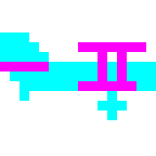
Gez Posted June 20, 2014 Not very legible. FreeZM? The one with the plasma effect even erases the kerning between D and M, so it turns into a big block. 0 Share this post Link to post
CaptainW Posted June 20, 2014 Unfortunately, it's way too much fun to mess around with it, so you'll have to bear with this one too. 0 Share this post Link to post
Guest Unregistered account Posted June 20, 2014 fraggle said:I wouldn't hold that up as an advantage: the current font (the one used in the menus) isn't very good and I'd really like to see it replaced. Agreed. When playing on some sourceports that scale the text down dramatically, I could barely read the in-game messages. :S 0 Share this post Link to post
Clonehunter Posted June 20, 2014 It does sorta look like "Free IZM" Mm, maybe remove the gaps in the D or maybe make them a bit smaller, and the gap in between the D and M a tad bigger? 0 Share this post Link to post
Guest Unregistered account Posted June 20, 2014 I think it looks fine but for the sake of pleasing everyone, maybe make the gaos smaller. Don't remove them. (So I guess it's official? It's going to be the M_DOOM?) 0 Share this post Link to post
Mechadon Posted June 20, 2014 fraggle said:I wouldn't hold that up as an advantage: the current font (the one used in the menus) isn't very good and I'd really like to see it replaced. That reminds me, I have a finished font to donate! I'll prepare a thread for it. 0 Share this post Link to post
CaptainW Posted June 20, 2014 And because I can't leave a terrible thing alone, I've also added a highlight. 0 Share this post Link to post
Gez Posted June 20, 2014 Much more legible now. :) Joe667 said:(So I guess it's official? It's going to be the M_DOOM?) That's for Fraggle to decide I suppose. 0 Share this post Link to post
fraggle Posted June 21, 2014 The "DM" part looks really nice now, great work. But the metallic "Free" still looks wobbly to my eyes. It's hard to put my finger on why exactly. Perhaps the lettering needs to be more straight and consistent? Oddly enough it looks better when I download the image and zoom in (as opposed to viewing directly in my browser), so perhaps I'm crazy and it's just my eyes playing tricks on me. I think the current version is certainly nice looking enough that I'm happy to commit it as-is. The most recent image is 207x124, but the TITLEPIC graphics need to be 320x200. What should we do for the title screen? (in absence of any other suggestions I'll probably just put it on a black background or maybe a screenshot from a level, but maybe we can do better). It's too big for an M_DOOM, but we can certainly scale it down. 0 Share this post Link to post
Guest Unregistered account Posted June 21, 2014 I dunno, the "Free" doesn't look too bad to me. :/ Maybe it's the diagonally slanted white reflection? Either way, if anyone had trouble reading the "DM" before, they won't have it again. Also, what did you use to make it? I'd guess photoshop, but... yeah. It looks awesome! 0 Share this post Link to post
CaptainW Posted June 21, 2014 *bows humbly* Paint Tool SAI, actually, he he. If you guys are also hoping to make a TITLEPIC of it, I actually work on it at a much higher resolution. In other news, I messed about a little more. I actually get what's meant by wobbly. SAI does have sort of a "straight line" tool, but an extremely awkward and impractical one and no text tool at all, which leaves freehand drawing as the bulk of the work. Still, I had some sloppy beveling going on which I removed on this one up there. Down there is the lettering without any sort of metallic effect... ...and that one I just did for the hell of it. I'm WAY too fond of that lightning. Note that even though there's no text tool, there is a "black and transparent" tool that allows one to hack any text into a picture using screenshots of a word processor. If there's any (free, of course) font you can think of for use in the logo, suggestions are welcome. 0 Share this post Link to post
fraggle Posted June 23, 2014 Thanks for the hi-res versions. It's always good to provide the original source images as there's always the possibility someone else might need to modify it in the future. I tried superimposing the logo image over some screenshots from FreeDM levels to see if it's possible to make an interesting looking title screen. Here are a few examples; what do you think? Good idea or bad idea? Also, it's not a big issue but I figure it's worth noting at least: the 'D' gets a bit messed up when I convert to the Doom palette. 0 Share this post Link to post
CaptainW Posted June 23, 2014 Noted. Gave a try at smoothing the shading on the D. I'm wondering if brand new artwork shouldn't be made for the TITLEPIC, though. Am beaten on what it could be, since the evolving weapon designs would probably prevent any sort of action scene... 0 Share this post Link to post
fraggle Posted October 3, 2014 Finally got round to adding the new logo. Thanks! 0 Share this post Link to post