About This File
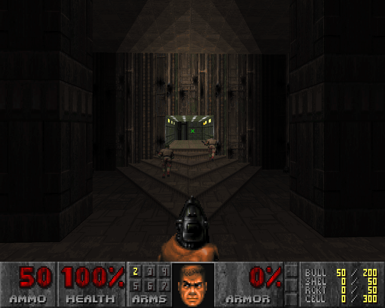
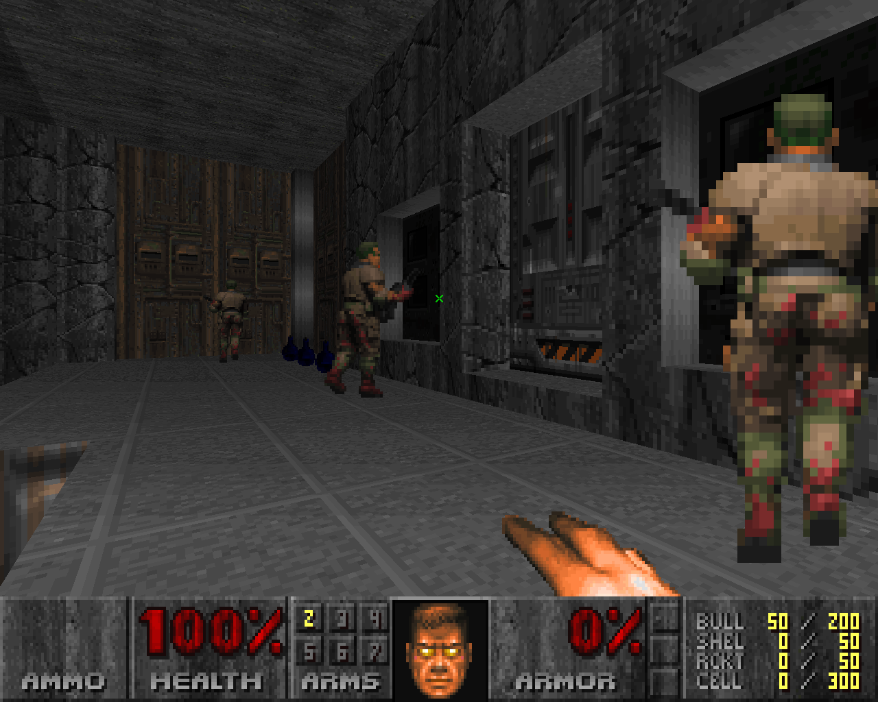
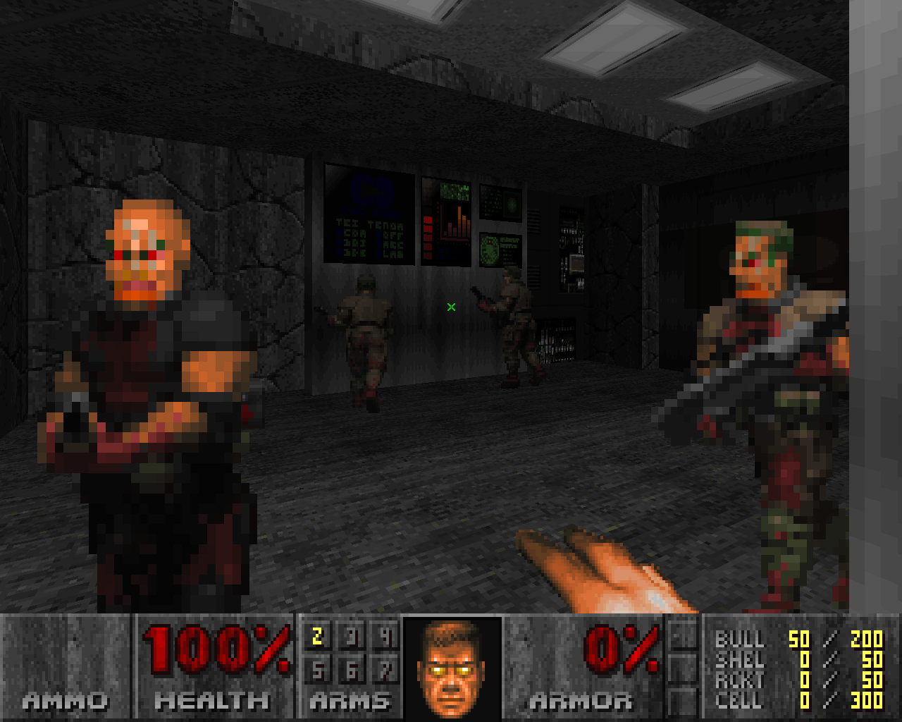
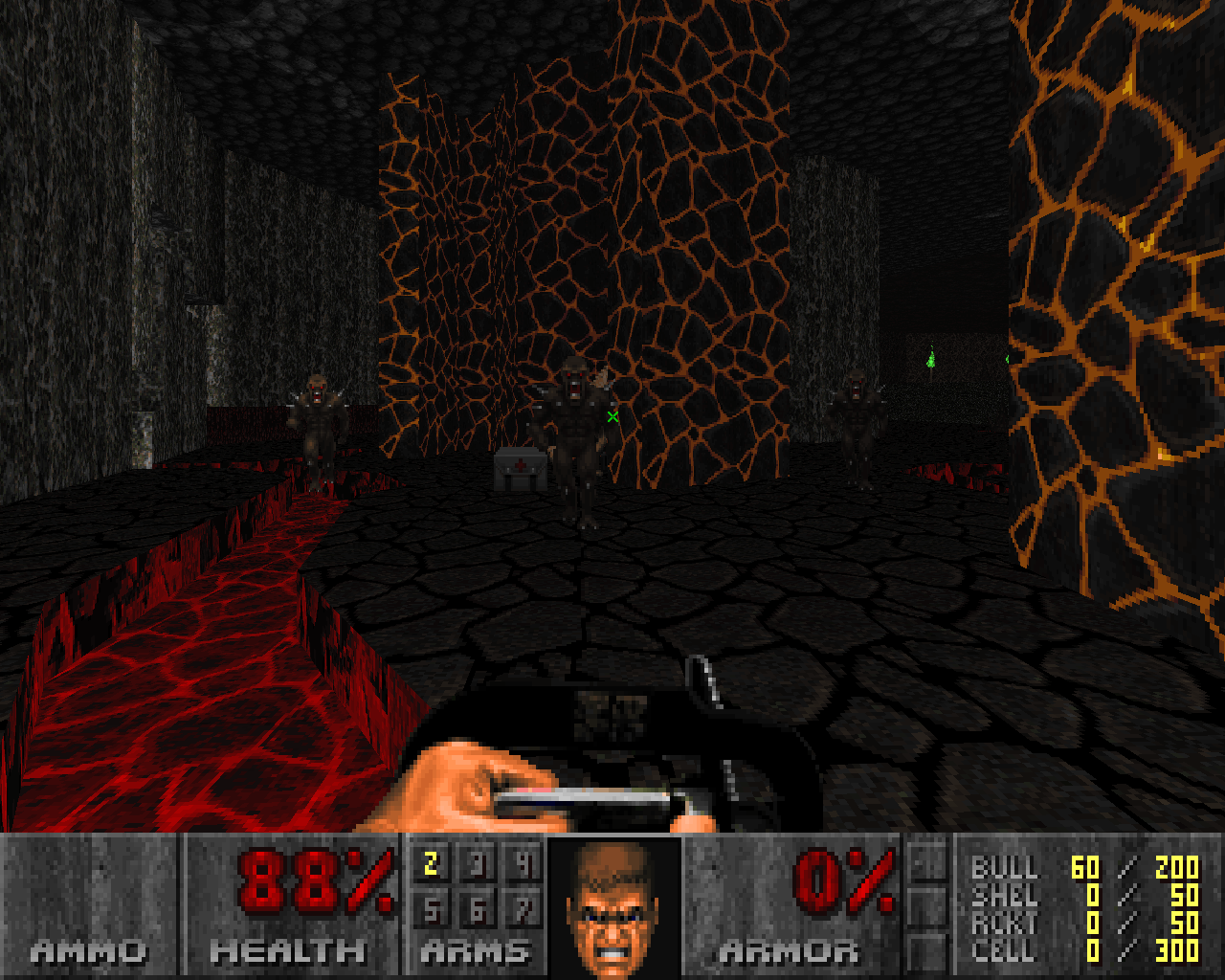
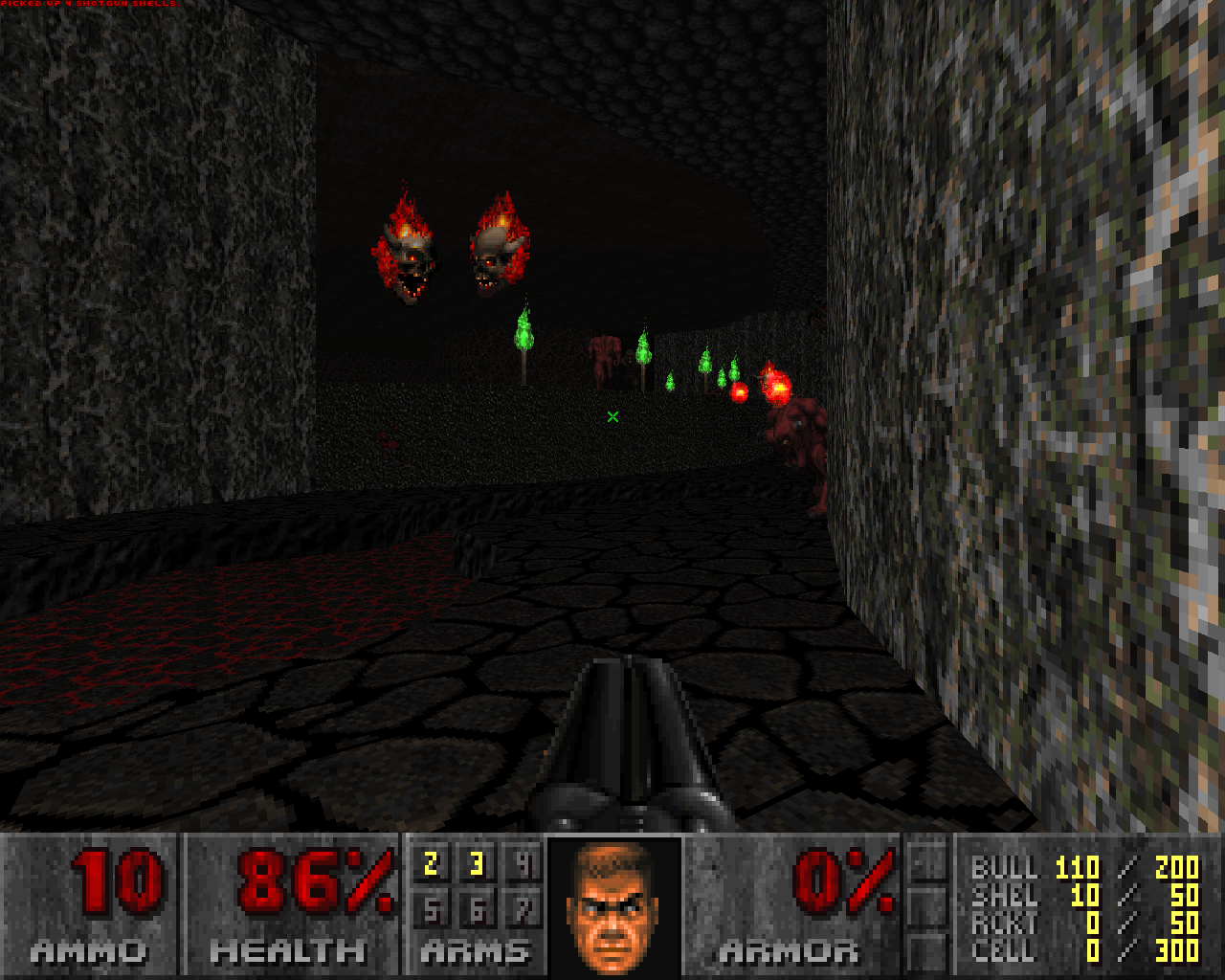
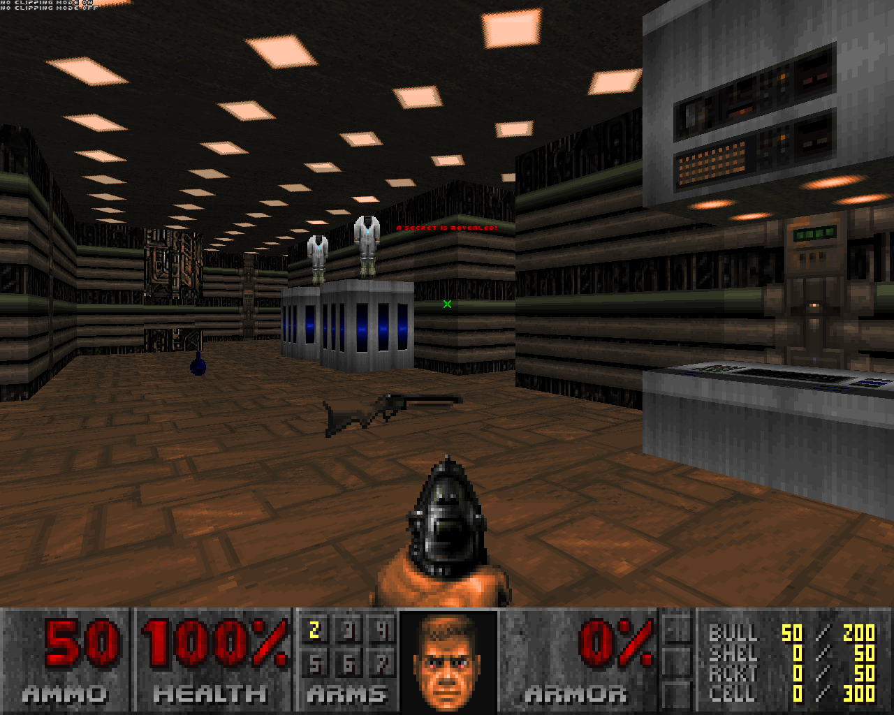
PalPlus is a patch WAD for all versions of Doom, including vanilla. Its intended function is specifically to improve visibility on modern LCD monitors and generally to simply make Doom look much better.
PalPlus works by increasing the contrast of luminance and color saturation in Doom's PLAYPAL lump and remapping the COLORMAP lump based on the former under the constraints of exclusive palette index selection.
The original Doom palette has remain constant since the very first alpha versions of the game and was not altered in any further releases or versions. The palette was created for the atypical CRT monitors and television sets of the early nineties which featured far less power and flexibility than modern LCD monitors, and specifically reduced contrast and sharpness. As LCD monitors became the norm, the original Doom palette began to show its age.
There are several different schools of thought regarding how color maps should be generated. The first, which was used in the original Doom, was to make all 256 colors in the palette available to the color map generation algorithm. This method works best with palettes that have a wide range of color tones. However, Doom's palette features relatively few distinct tones, most of which are browns and reds.
The second method, which was utilized in the creation of PalPlus, restricts the color map generation algorithm to close relatives of the color tone currently being generated in the color map. When used in combination with the improved palette, lightness-based color shifts will ideally appear simultaneously smoother and more distinct to the human eye while displaying less artifacts and abrupt color cutoffs.
The creation of PalPlus required tools which did not exist, and software written in C99 were specifically created for the development of this project. The partially finished product was extensively tweaked using the color map generation tool in XWE gradually over a period of over two years and went into testing sporadically during that period until it was deemed ready for release.
Depending on the user and system, PalPlus may or may not make Doom look better to the observer. Extensive testing has shown that there are people who like it and those who don't. If you don't like it, then that's fine.
If you do enjoy using PalPlus, then consider playing some of your favorite WADs with it, as it makes playing them a new experience.
Keep in mind that some WADs feature their own PLAYPAL or COLORMAP lumps which may override those contained in PalPlus, or vice-versa. The order in which they are specified in the command line is important and pal_plus.wad should be specified at the end for best results. The end results when used in combination with WADs that use incompatible palettes are unknown.
