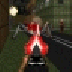
pcorf Posted September 18, 2011 Paul's Deathmatch is a 32 level DM Megawad for Boom Compatible source ports I've slowly worked on over the last year or so. Actually last 3 years or so because MAP01 was made in 2008 and was supposed to be a DM level for WOS but I dropped the DM idea. MAP16 was completed a year ago then after a delay I got back to work on it 6 weeks ago. MAP's 17 to 32 were made from July 27, 2011 to Sep 18, 2011. Each map features * Different Themes (Base, Hell, Spaceship, City and more) * 8 DM Starts per level except for MAP07 which has 4 starts * All Weapons * Backpacks * Invisibility * Some maps are symmetrical (MAP07, MAP11 and MAP27 for example) * Plays from MAP01-30 with secret exit in MAP15 to MAP31 and 32. * Original new music except for MAP32 Download it here: paulcorfiatis.com/paul_dm.zip (1.44mb zipped) I think this WAD is ready to be uploaded but before that just wanna double check it with others. All feedback and suggestions would be greatly appreciated. 0 Share this post Link to post
DeathevokatioN Posted September 18, 2011 These are really good looking maps, and most of them have good layouts too. I keep getting the feeling that if you added monsters to Map05, made a player start in the cave and removed the teleporter there that it'd make a worthy submission to "No Hope for Peace" :P. 0 Share this post Link to post
DeathevokatioN Posted September 18, 2011 There were a few things I'm skeptical about though, like torches below ledges where you can jump off, and ambient lighting which IMO doesn't always go well with intense death matches, I don't know much about online multiplayer ports but I think some of them have settings on by default that make actors infinitely tall. But then again I'm more of a single player so I don't know much about online multiplayer. Maybe you could pm some of the respected members of the multiplayer community here such as Ralphis and Dew and ask for their opinions on this before you upload it? 0 Share this post Link to post
esselfortium Posted September 19, 2011 I looked through most of these maps, and I have to be honest: I don't really remember finding any that had very good layout flow for deathmatch. There were a lot of crampy corridors, made worse by the heavy use of 90-degree angles, lots of weapons placed directly in the middle of main paths so it's easy to pick them up and be forced into a weapon switch by accident, lots of uncomfortably dark lighting, and in general I didn't find it possible to run around in many of them freely without frequently either hitting dead-ends or bumping into something. Have you read deathz0r's guide to multiplayer layouts? I've found it to be very informative. 0 Share this post Link to post
valkiriforce Posted September 19, 2011 ^ I think you're being overly critical; I thought these were rather decent. 0 Share this post Link to post
Hellbent Posted September 19, 2011 valkiriforce said:^ I think you're being overly critical; I thought these were rather decent. I sort of have to agree, but that's not to say Essel doesn't make some important points. MAP01: I would make 112 72 wide cut through the bridge (with rounded edges) to the plasma rifle so that when you are down below you can circle around without having to back out of the corners where the access point of the bridge is, if you know what i mean. _________ <-- bridge \ 72... | to plasma.. | wide | _________/ floor.| MAP02: The protected dm start on map02 should probably be done away with since it's a dead end if you go into it, although a quick play with bots I didn't find this to be a problem. MAP03: the passageways on the outside of the map are too long. Long passageways are gameplay killers. MAP04: i don't see anything wrong with this map MAP05: The pillars that you run around on are probably not a good idea. the torch trap forcing you to lower the lift is annoying in a high speed game--regardless of the reward. Dm is about smooth flow and easy navigation--"paying" (in the way of an annoyance) for rewards never equates to fun DM. I've attempted similar things in my dm maps but I've never had success with it. I'd do away with the pillars and torch trap all and stick to more traditional terra firma. Some of the organic stairs in the map are cumbersome to climb. Again, you are a bit too ambitious in this map trying to push creativity and you are getting away from simplicity when gameplay always prefers simplicity. Cumbersome stairs = very bad. MAP06: I think your containment area is awesome. The crate stairs are a bit too difficult/cumbersome, tho. The teter crate is very cool to look at and gives great ambiance, but is quite snaggable and probably should be replaced by more traditional fare :( MAP07: nicely done for what it is. You can just jump to the shelves on the edge of the map.. might be fun to pust stuff on there? maybe armor helmets, stimpacks or a blur sphere on one shelf? not sure about that. MAP08: berserk packs seem like they'd prolly just get in the way MAP09: maybe make the acid -10: radsuit leaks in DM I imagine would be mighty annoying. MAP10: How about some light amp goggles and maybe another staircase to better supplement heavy lift use. (lifts in DM aren't too fun) MAP11: maybe replace berserk with 5 stacked medkits? (maybe do this on other levels, too). I think this level looks like fun. MAP12: Not sure about the 'warrens' ... umm.. how about light switches? Then people can fight over whether the level is bright or dark. If not, I'd say up the light level by about 80 or so or put enough light amp goggles to have the level lit 75% of the time. MAP13: 64 wide bridge gaps: I have to agree with snakes.. I've experimented with this as well and it's never been satisfying. You're better off developing more traditional terra firma layouts than these broken bridges for duel passageway. One possible alternative is to make really steep stairs on either side of the raised platforms so that you can fly up the sides (there's a bean shaped map in gw2 that has two such raised platforms). It's a more free-for-all kind of gameplay, but it's probably going to be more fun than squeezing through 64-wide broken bridges. You could also experiment with insta-bridges, which I believe are vanilla compatible. For an example you could look at a dm map I never released that uses insta-bridges: http://www.mediafire.com/?d8wgmj95ihr7r02 MAP14: This is a really cool layout, but teleports facing light pillars are damn cumbersomely annoying. Are teleports even that fun in DM? All my best DM maps do not have teleports. :-/ Maybe get rid of some or all of the teleports in this map. Also, might want to remove some of the light columns and/or increase the spacing in the map. As a general rule, in my dm maps I try very hard to avoid any passageways that are less than 128. This is a great layout hampered by clutter by the light colulmns You should experiment with windows like the ones in this map more. 0 Share this post Link to post
Snakes Posted September 19, 2011 Some of the early maps have some potential with thing rearrangement, but the second half is especially rough if you ask me. I'm closer to essel's opinion than Death's. Most of them felt either cramped, symmetrical, dim, flat, or a combination of all three. I'd definitely go through a lot of these maps, highlight them, and ++32 brightness the whole thing. I had to turn my gamma level up to uncomfortable areas like 3 or 4 to see what was going on. Also, cut back on those 64-unit corridors please. 0 Share this post Link to post
pcorf Posted September 19, 2011 Thanks for your suggestions. I will look at the major issues. MAP05, I will remove the flame sticks from the plasma gun pillar. MAP12, hmm its a haunted house so it should be dark. Perhaps I will lighten it up a bit to 128. Don't like the idea of light switches because it will ruin the realism. 0 Share this post Link to post
Hellbent Posted September 19, 2011 pcorf said:Thanks for your suggestions. I will look at the major issues. MAP05, I will remove the flame sticks from the plasma gun pillar. MAP12, hmm its a haunted house so it should be dark. Perhaps I will lighten it up a bit to 128. Don't like the idea of light switches because it will ruin the realism. But gameplay always has to supercede such considerations when designing for deathmatch. 0 Share this post Link to post
dew Posted September 19, 2011 yeah, i'm with hellbent on this one. it might look nicer that way or it might be an interesting idea, but in the end people won't see their opponents and that beats the concept of shooting each other, so they will move on to brighter maps. i'm struggling to recall a single successful DM map with a darkness theme. 0 Share this post Link to post
pcorf Posted September 19, 2011 I increased the brightness of most maps by 16 and 32 and it made a big difference. Esp in MAP12! 0 Share this post Link to post
pcorf Posted September 21, 2011 I think its ready for upload soon. Thanks for your suggestions. 0 Share this post Link to post
pcorf Posted September 28, 2011 Wad has been finally released. Its in idgames but does not show up on the latest files because of the many recent releases. Download it here: http://www.doomworld.com/idgames/index.php?id=16572 I made various changes such as increasing the light levels in most of the maps and that made a big difference for sure. Major changes. MOST MAPS - Light level increased, esp MAP12 MAP03 - Extra lifts added around the upper corridors MAP05 - More steps added to cave staircase MAP06 - Cratiny moved to make access to exit easier from ground level MAP10 - A few modifications such as an additional staircase, light amp visor and increase in overall light level. MAP16 - A bit of extra detail added This was not intended to be the best DM megawad in the world. To be honest I just had fun making this and had no real ideas. The maps were just made at random themes to whatever mood I was in. MAP01-30 with as ecret exit in MAP15 to MAP31 and MAP32. There is no secret exit in MAP31 which takes you straight to MAP32. In MAP15 you must shoot Jill in order to open up the secret exit. All the music is original except for MAP32 which is an organ version of "Waiting For Romero To Play' as MAP32 is a tribute to John Romero himself. 0 Share this post Link to post