Coopersville Posted October 2, 2018 Like in the last game, that can probably be fixed with the grimdark filter. 0 Share this post Link to post
ReaperAA Posted October 10, 2018 The monsters look fine imho. The health and armor pickup look a little bit cartoonish, especially the blue round flasks and the big green armor vest. 0 Share this post Link to post
Guest Posted October 31, 2018 (edited) On 9/7/2018 at 9:47 PM, Touchdown said: Since I'm probably the first person that has used the term 'cartoony' in regards to DE I think I should comment on that subject and offer some explaination. Bear in mind I have already talked about all of this in different threads so I'll be repeating some of that here. Also, I already know 99% of people think my opinions are stupid. Just thought I'd mention that I'm aware of that. 1. When I said that DE is cartoony I was talking pretty much only about certain enemy desings/redesigns introduced in the game. Those include: new Zombies, new Possessed Soldiers, new Mancubi, Arachnotrons and Pain Elementals. I don't use the word 'cartoony' in a literal sense but rather to emphasize the decision to move further away from a gritty visual realism in favour of a more over-exaggerated, stylized look. Comic book like if you prefer. 2. One of the few things I was critical about in DOOM4 was the inconsistency of enemy art direction. On one hand you've got creatures that belong in the category of a grotesque, realistic depiction such as Possessed, Hellknights or Summoners. Even Cacodemons managed to look sufficiently and appropriately 'serious' while retaining the recognizable and iconic look. But on the other hand you've had monsters such as Lost Souls, Hell Guards, Pinky Demons or the Cyberdemon that either looked way too stylized or downright toy-like. Pinky is probably the biggest offender there where both its look, sounds and behaviour were straight out of a cartoon about an angry monster that trips over its own legs. DE seems to have leaned even more in that direction. The new Zombies look almost like something out of a Scooby-Doo with their stupid faces. A massive step down from the really cool looking, and way more original, counterparts in D4. Arachnotrons should have been more sinister, as they appear in the teaser. Don't even get me started on the Pain Elemental. All the other enemies suffer from an unnecessary nostalgia-pandering. They're all too faithful to the originals with no regard to the fact that the original game was made with a much more primitive technology. The original designs worked within the graphical fidelity of the first two games. They look comic book like / cartoony when considered without context, yes, but I don't believe they were meant to be silly and ridiculous. Why? 3. Note that id has always been pushing more and more towards an aggressive, gritty visual realism with their games. They went from goofy Wolf3D style to a more realistic approach in DOOM, ramping it up with some really messed up and grotesque monsters in Quake, brutal abominations in Quake2 and later on various horrors in DOOM3. As technology was improving they've been consistently making their worlds and characters more gritty / realistic and less goofy. So I definitely disagree with the argument that just because the original DOOM monsters look cartoony now that means that recreating them 1:1 in a modern engine is commendable. It ignores the original intention. And the original intention was not, as Hugo Martin tries to tell you, a goofy, silly and utterly ridiculous game. DOOM got rid of lives and score to make it more realistic. They've added a diminishing lighting to make the environments scarier - something that gets easily overlooked because with hardware rendering in modern source ports the diminishing lighting is almost unnoticable. It was supposed to be scary, dark and fast. Not a horror game, not without over the top elements but not completely silly and cartoony either. 4. The bottom line is I believe visually the new DOOM games should have been more in line with the original progression of id titles and more consistent without jumping between so many different styles. And they mostly are. The environments look realistic, weapons look realistic, a lot of the monsters look realistic. But they just keep pushing those action figures into the mix, trying to bury everything that was ever serious or scary in the franchise. And successfully it seems because apparently goofiness is what people want out of DOOM. I don't believe the game would have lost ANYTHING if monster designs were all rooted in the gritty realism already present in great quantities. In fact it would have been way more visually consistent this way. BONUS NOTES: >> I disagree that the visible eyes make the DE Hellknight look cartoony. From what I've seen it looks pretty cool.>> I strongly disagree that realism has no place in DOOM. But I am talking about the visual realism as seen in environments and weapon designs. I expected enemy designs to follow.>> I disagree that the human characters look overstylized. I don't see the problem there. Also it's funny that some people get offended when someone complains about silly monster designs but human characters that are maybe a tiny bit stylized are automatically Disney characters somehow. I know it's an exaggeration but still.>> I do not consider the arcade gameplay of the new DOOM games to be unfitting. It works very well from the gameplay perspective.>> I disagree that the D4 Imps look silly. I think they are stylized but not overstylized like some of the other monsters.>> If you are one of the people who think that the D4 Pinky does not look out of place in the D4 environments then I don't think anything I said makes any sense to you. Also you're weird. You're speaking from my soul. Now that I've seen the cartoony look of DOOM Eternal, I am disappointed because that is not the path that I was hoping for Bethesda to continue. Demons and Humans look outright caricaturistic. I just can't overcome the disbelief the aesthetics emanate. In regards of pure story telling, I was glad that they threw out all the ridiculous ideas that Doom 1+2 were (silly bunny). In my opinion that was absolutely fitting for 1993 and with the manpower and technology that id had to make due and I truly think Doom 1+2 were great games. And as much fun as killing demons is also in DOOM, I want the game to tell a compelling and believable story. (And I think many people feel the same, otherwise Duke Nukem Forever wouldn't have flopped so hard.) I loved the approach that you could have as much story as you wanted in DOOM or close to none at all if you are just enjoying killing demons in a thousand ways while feeling absolutely powerful. While I didn't read most of the data logs, I found the story telling and the visual story telling was enthralling and believable. DOOM:E throws all that out of the window. Another big gripe of me is that id Software tried to inflate the coolness of everything. I am a big, big fan of the Praetor suit. It looked absoutely badass but at the same time it fitted visually to the agile game play, while still giving the feeling of being a piece of real tough armor. In DOOM:E they emphasized the agile gameplay even more, while putting the Doomguy in a clunky, fat suit. With the biceps exposed. It's ridiculous. The last time I found this cool was in 8th grade. Edited October 31, 2018 by Guest 0 Share this post Link to post
FractalBeast Posted October 31, 2018 I'm actually happy that DE is more cartoony. I wish it was more cartoony. Because it gives me a slim hope that we'll get a proper Lovecraftian horror Quake. Preferably one where we don't magically kill a Lovecraftian horror by telefragging because that always ruined the mood for me. It's ironic that Q3's story is more properly Lovecraftian cosmic horror than Q1. :D 2 Share this post Link to post
ReaperAA Posted November 1, 2018 (edited) On 10/31/2018 at 6:26 PM, FractalBeast said: I'm actually happy that DE is more cartoony. I wish it was more cartoony. Of course it needs to be more cartoony. Otherwise how would it attract the fortnite kiddy demographic when they don't see enough happy colourful visuals :) On 10/31/2018 at 6:26 PM, FractalBeast said: it gives me a slim hope that we'll get a proper Lovecraftian horror Quake. Preferably one where we don't magically kill a Lovecraftian horror by telefragging because that always ruined the mood for me. It's ironic that Q3's story is more properly Lovecraftian cosmic horror than Q1. :D I really hope we get to see a proper single player quake game one day that isn't another strogg storyline. 1 Share this post Link to post
TakenStew22 Posted November 1, 2018 1 hour ago, ReaperAA said: Of course it needs to be more cartoony. Otherwise how would it attract the fortnite kiddy demographic when they don't see enough happy colourful visuals :) I'm getting more tired of this meme than Fortnite itself. I've seen ALOT more people hate bandwagoning the game than people defending it. 2 Share this post Link to post
Koko Ricky Posted November 1, 2018 That's because there's too many entitled, delusional folks that think corporations owe them some sort of personally catered version of their product. 4 Share this post Link to post
NoXion Posted November 1, 2018 (edited) 2 hours ago, GoatLord said: That's because there's too many entitled, delusional folks that think corporations owe them some sort of personally catered version of their product. I think that's a bit harsh. I reckon that people have gotten used to being able to tailor their own game experience via modding, but the issue with this is that a lot of latter-day AAA games aren't as easily modded as they used to be. People just need to catch up with that. 0 Share this post Link to post
Korikon Posted November 1, 2018 On 9/6/2018 at 4:07 PM, TakenStew22 said: This is the most common complaint I've seen on the trailer, and I don't get it. The demons almost look completely identical to their original counterparts, and I love it. People were also saying that the demons in 2016 looked cartoony aswell. What do you guys think? And people were complaining about doom 2016 not being cartoony enough I hate my life at least its not as bad as SJWs being annoying or people saying it's too fast paced (Which you shouldn't be playing doom if that's a complaint). 0 Share this post Link to post
OliveTree Posted November 2, 2018 I restate my argument. The creature designs are all excellent and I can practically smell the meetings full of excited people going over them. I just think they don't mesh with each other. The game lacks a unified art style, which is important for making your product appealing. 0 Share this post Link to post
ReaperAA Posted November 2, 2018 11 hours ago, TakenStew22 said: I'm getting more tired of this meme than Fortnite itself. I've seen ALOT more people hate bandwagoning the game than people defending it. I wasn't hating on Fortnite itself, its a good game. I was just making fun of people who consider it the second coming of Jesus. 1 Share this post Link to post
TakenStew22 Posted November 2, 2018 6 hours ago, ReaperAA said: I wasn't hating on Fortnite itself, its a good game. I was just making fun of people who consider it the second coming of Jesus. Far enough. 0 Share this post Link to post
PsychoGoatee Posted November 2, 2018 I love the art style, and I think cartoon is just another word for anime if I'm reading these dictionary entries correctly, and anime as we know from Akira, Berserk, and Cowboy Bebop is pretty badass. How about Vampire Hunter D, that dude is cutting heads off like you read about. So I say thumbs up. 1 Share this post Link to post
TakenStew22 Posted November 2, 2018 (edited) 45 minutes ago, PsychoGoatee said: and I think cartoon is just another word for anime No, it isn't. But yeah, you do you. 0 Share this post Link to post
PsychoGoatee Posted November 2, 2018 Just now, TakenStew22 said: No, it isn't. Little joke for ya, ya know since anime means animation aka cartoon, I flow loose like a jazz musician on here. 1 Share this post Link to post
kb1 Posted November 3, 2018 Can someone post an image showing the "cartoony" stuff? 0 Share this post Link to post
Dragonfly Posted November 3, 2018 (edited) Have some timestamps for the reveal video as parts that stand out as cartoony. No, I don't mind them personally. Yes it's literally only glory kill animations. Rewatching this got me re-hyped for the game, oh my! 3 Share this post Link to post
OliveTree Posted November 3, 2018 23 minutes ago, Dragonfly said: Rewatching this got me re-hyped for the game, oh my! My feeling exactly. Dang people at id working hard to make the game actually good. I want it now! 3 Share this post Link to post
Tetzlaff Posted November 3, 2018 8 hours ago, kb1 said: Can someone post an image showing the "cartoony" stuff? 1 Share this post Link to post
FractalBeast Posted November 5, 2018 On 11/2/2018 at 2:02 AM, EtherBot said: I restate my argument. The creature designs are all excellent and I can practically smell the meetings full of excited people going over them. I just think they don't mesh with each other. The game lacks a unified art style, which is important for making your product appealing. That's not really something id can fix. A chaotic artstyle lies at the core of Doom, has always been a part of Doom. You cannot combine AND scifi AND fantasy demons AND oldtyme double barrel shotguns. Why bother unifying what cannot be unified anyway? 2 Share this post Link to post
Chezza Posted November 5, 2018 I find Doom Eternal to be quite aesthetically pleasing. And yet I actually have a preference for more sinister monsters and environments. Monsters are great but please give us more gory techbase or at least freakier Hell. Show me faces merged into computer screens, intestines connecting to piping, satanic symbols on the walls. A little terror and horror will satisfy me. 3 Share this post Link to post
OliveTree Posted November 5, 2018 14 hours ago, FractalBeast said: That's not really something id can fix. A chaotic artstyle lies at the core of Doom, has always been a part of Doom. You cannot combine AND scifi AND fantasy demons AND oldtyme double barrel shotguns. Why bother unifying what cannot be unified anyway? I beg to differ. Doom 3's and Doom 2016's art styles felt cohesive. Some of the character design in Eternal would only need cellshading to fit perfectly in Borderlands whereas the environments look like typical D'16 stuff. 0 Share this post Link to post
igg Posted November 5, 2018 5 hours ago, EtherBot said: I beg to differ. Doom 3's and Doom 2016's art styles felt cohesive. Some of the character design in Eternal would only need cellshading to fit perfectly in Borderlands whereas the environments look like typical D'16 stuff. Borderlands initially had realistic graphics, like Rage. It was after the Rage reveal Borderlands dev's decided to switch the art direction. 1 Share this post Link to post
OliveTree Posted November 5, 2018 10 minutes ago, igg said: Borderlands initially had realistic graphics, like Rage. It was after the Rage reveal Borderlands dev's decided to switch the art direction. I'm not sure how thats relevant other than being sort of interesting I guess 0 Share this post Link to post
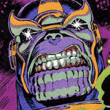
Koko Ricky Posted November 5, 2018 On 11/3/2018 at 8:16 AM, Tetzlaff said: What gives this a cartoony edge is the proportions, not the textures or lighting. Slightly hyperbolic features as opposed more explicitly humanoid. 1 Share this post Link to post
ReaperAA Posted November 6, 2018 5 hours ago, GoatLord said: What gives this a cartoony edge is the proportions, not the textures or lighting. Slightly hyperbolic features as opposed more explicitly humanoid. This is evident incase of the civilians, keycard-dude and the pinky. Rest of monsters have ok proportions though. 0 Share this post Link to post
Koko Ricky Posted November 6, 2018 I disagree. The cyberdemon has giant clunky arms and legs, and a massively wide jaw. Those are classic cartoon proportions. The original has a more or less humanoid (albeit very muscular) form. 0 Share this post Link to post
OliveTree Posted November 6, 2018 1 minute ago, GoatLord said: I disagree. The cyberdemon has giant clunky arms and legs, and a massively wide jaw. Those are classic cartoon proportions. The original has a more or less humanoid (albeit very muscular) form. I can't speak for everyone here, but like I said it isn't about 'cartoony = bad' imo. Its about a consistent art style. Some of the new monsters are way too cartoony now whereas others arent cartoony enough. A weird cartoony action epic isnt a bad pitch for a doom game and an exciting gritty action marathon isn't either, but both? Its weird to me because some monsters like the new zombies and the pain elementals look deliberately designed to be very exaggerated and expressive whereas others are designed to be more realistic and 'sinister' and imo it gives off a weird effect when they're standing right next to each other. 0 Share this post Link to post
ReaperAA Posted November 6, 2018 (edited) 1 hour ago, GoatLord said: I disagree. The cyberdemon has giant clunky arms and legs, and a massively wide jaw. Those are classic cartoon proportions. The original has a more or less humanoid (albeit very muscular) form. o yeah i forgot about him. he is cartoony too 0 Share this post Link to post