Koko Ricky Posted January 29, 2019 I'm reminded of a great lecture I watched about what not to say when pitching your game to a studio. One of those faux pas was to justify a particular feature (or lack thereof) by virtue of realism. It's not a good rationale becsuse, outside of highly specific sim games, most gamers don't care about realism on a deep level. 2 Share this post Link to post
rampancy Posted January 31, 2019 On 1/29/2019 at 9:10 AM, GoatLord said: ...most gamers don't care about realism on a deep level. agree 100%. its more about whats cool or exciting, a word like visceral comes to mind. for example look at the new quake 1.5 beta. still throwbacky as hell, but with more shit happening faster on screen, and mostly maintaining that og quake 1 vibe. sucks me right in. or ion maiden, super fun to look at. its all pretty subjective though. so id say hey, if youre an artist then create what you are inspired to create. like minded people will appreciate it. trying to figure out what one thing is best and only do that is a soulless, conformist, corporate profit driven behavior that should be avoided, imho. 0 Share this post Link to post
OleBumma Posted January 31, 2019 (edited) the chasing of realism in scenarios and characters is actually what gets me really bored. we already had a Doom impact to that with Doom 3, so I'm glad that Doom Eternal looks "cartoonish". it's what the game used to be back in the days and I'm glad they added back that fast pace rhythm to the gameplay where you have no time to rest! what I'm not very feeling is the lack of complexity/difficulty in killing enemies... the game has more of a Quake 3 Arena style from what I've seen from the trailers, and they focused on surrounding the player with plenty enemies all around to add difficulty to the battle, therefore killing a Pain Elemental or a Baron of Hell will take less than what it took in the classic game, 'cause the player can't bother to waste that much time killing one enemy when there are plenty others all around. I hope they're saving that complexity with the introduction of new enemies, or making some of the already known ones stronger to defeat. what made the classic game dope was the competitivity you had to gather during the battles, and if all the balling is gonna revolve in jumping around all over the maps, dodge fireballs and collect plenty frags, that's something I already experienced in games like Q3A. 1 Share this post Link to post
Tetzlaff Posted February 8, 2019 The Doom 3 monster designs are fantastic, not realistic. It's not just a matter of the level of realism in game. 0 Share this post Link to post
VGamingJunkie Posted February 10, 2019 I think, by realism, they mean Doom 3's monsters don't stick out as much. You could argue they're more "logical" in their designs than Doom 2016 and Eternal's designs are. The issue is that it makes them more dull and generic. Sure, the Doom 3 Pinky may make more sense than the Doom 2016's that's too top heavy to keep its head off the ground half the time but that gives the 2016 Pinky personality, and also does a good job instilling that chaotic charm that Doom's demons have been known to have. After all, as is series tradition, they'll turn on each other over a stray shot, Doom's Hell is rightfully portrayed as a chaotic mess, it shouldn't have to make logical sense. 0 Share this post Link to post
snapshot Posted February 10, 2019 Do people really hate Doom 3's monster designs that much? I thought they all looked fine and genuinely creepy at times, well except Lost souls and Cacodemons, those just looked stupid. 3 Share this post Link to post
Chezza Posted February 10, 2019 @tempdecal.wad I share your opinion. Most of the monster designs were very adequate for that particular game. I found the pinky and Hell Knight unique and intimidating. What keeps to mind is just how repetitive monster encounters are. But that's digressing and an entirely different discusion done many times before. 1 Share this post Link to post
seed Posted February 10, 2019 I also find most monster redesigns in D3 to be good, except for the Cacodemon and Lost Soul, like wtf... 2 Share this post Link to post
igg Posted February 10, 2019 11 hours ago, tempdecal.wad said: Do people really hate Doom 3's monster designs that much? I really liked all monsters, except the Arch-Ville and the Cacodemon. Doom 3s monster design was very "fleshy", it really emphasized Doom 3s universal rendering approach. Maybe I should replay the game? 1 Share this post Link to post
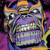
Koko Ricky Posted February 12, 2019 (edited) A lot of them are good if not great. In particular I like the possessed, demon, cherub, mancubus, hell knight, and maggot, which look threatening and memorable. The rest range from missed opportunities (lost soul, imp) to underwhelming (cyberdemon) to just plain boring (trite). I get the feeling that modern interpretations of the less stellar designs could make them more aesthetic. 0 Share this post Link to post
snapshot Posted February 12, 2019 I really like the Revenant, Archvile and the Mancubus. Doom 2016's Mancubus looks like a Quake strogg. At least they redesigned it for Eternal. 0 Share this post Link to post
Chezza Posted February 12, 2019 I like the Doom 3's Cyberdemon more than 2016s version. Remembering the Cherub, I found that a little out of place, like it belongs to another game with Demons. 1 Share this post Link to post
Simon Riley Posted February 16, 2019 On 2/10/2019 at 3:18 AM, tempdecal.wad said: Do people really hate Doom 3's monster designs that much? I thought they all looked fine and genuinely creepy at times, well except Lost souls and Cacodemons, those just looked stupid. It's not that we "hate" D3's monster designs, it's just that we like Classic Doom and Doom 2016/Eternal 's designs much better. And yes, D3's designs were a tad generic. 0 Share this post Link to post
Spectre01 Posted February 17, 2019 I was surprisingly pleased with Doom 4's monster designs, except for the Hell Guards. They looked like something straight out of a fantasy RPG, especially with the whole giant mace and magical staff they were carrying. One of the things that I believe is an integral part of the overall Doom aesthetic, that keeps it in the realm of sci-fi, is that demons do not simply "carry" weapons. They either discharge energy from their hands or have high-tech implants/augmentation. Possessed soldiers are obviously an exception, but if you gave a Hell Knight an axe in each hand or a warhammer to the Baron, it would be completely out of place. 2 Share this post Link to post
snapshot Posted February 18, 2019 (edited) I thought Pinky looked like an enemy borrowed straight from Warcraft, but nowadays I don't mind it very much. I guess I got used to it bumping into walls and tripping in cute ways. 0 Share this post Link to post
whatup876 Posted February 19, 2019 I thought Doom 3 had some interesting ideas for monsters as if they thought more outside the box. Problem is they go too far away from feeling like they came out of Doom, so a few adjustments like using better colors or adding some elements like spikes or horns could at least make them feel more "demonic". Otherwise, they feel more like aliens than demons. Which is funny considering how the D4 Mancubus might as well be the most different out of all Mancs. The most cartoonish Doom has been was in the RPG phone games and even then, their enemies had neat concepts that could fit both the classic Doom's and even later iterations of the series. 0 Share this post Link to post
pro_zealot Posted February 23, 2019 I saw another change that i don't like in the main video that i rewatched from last year QuakeCon. Baron of hell is red. - Doom 2016. Baron of Hell is black now. - Doom Eternal. This change makes the enemy looks less scary and demonic more like alien now. They shoud change the color back to original imo. What you guys think about this change? 0 Share this post Link to post
snapshot Posted February 23, 2019 It's grey, has horns, and flames. looks fine to me. 4 Share this post Link to post
Koko Ricky Posted February 23, 2019 (edited) 54 minutes ago, pro_zealot said: I saw another change that i don't like in the main video that i rewatched from last year QuakeCon. Baron of hell is red. - Doom 2016. Baron of Hell is black now. - Doom Eternal. This change makes the enemy looks less scary and demonic more like alien now. They shoud change the color back to original imo. What you guys think about this change? I think that's just a variation. And it looks a lot scarier than the original. Looks "alien," eh? So what do aliens look like? 4 Share this post Link to post
igg Posted February 23, 2019 1 hour ago, pro_zealot said: Baron of hell is red. - Doom 2016. Baron of Hell is black now. - Doom Eternal. This change makes the enemy looks less scary and demonic more like alien now. ... What you guys think about this change? I like the one in Eternal much more. Looks more serious and "rough". Doom 2016s Baron was way too cartoony. Like a Lego brick demon from Warcraft. 0 Share this post Link to post
TakenStew22 Posted February 23, 2019 49 minutes ago, igg said: Doom 2016s Baron was way too cartoony. Again with the term "cartoony". 2016's Baron was one of the few demons that looked almost completely identical to its classic version (along with the Revenant). They weren't trying to make it look "realistic" or "edgy". They made it as faithful to the original as possible, which is great. Now they're improving their designs even more in Eternal. With the Mancubi, Imps and Zombiemen looking so much more like their 90's counterparts. Not like they were bad in the first place though. And what exactly does a demon look like to you guys? Have you been to hell and seen one with your own eyes? 7 Share this post Link to post
whatup876 Posted February 24, 2019 (edited) While a lot of people discuss how the demons look, i wonder how they feel about the overall lore and backstory behind them and Hell. I think Doom 4 implied that the Hellrazers where kinda like a parasitic virus when they could have simply refered to it as a "curse" instead. Because otherwise, that kinda leans towards the 2005 Doom movie's plot. Then there's how some of them are UAC creations, which kinda ruins the aspect of Hell being so weird its home to a bunch of weird looking creatures. That and how Hell overall looked like it kinda "lowered" its power level which makes me wonder if it's just because there weren't enough Hell levels in the single player and some areas were meant to represent the Night Sentinels' world being taken over. Maybe some of the demons' backstories is kind of an issue with explaining some monsters in fiction, where it's better left unknown. Meanwhile, the classic Revenant's backstory (remains of dead demons being weaponized) could make more sense with the name. I also saw the lore being a reason why people prefer the 2016 Manc over the Eternal/OG one, even though his design kinda works as a representation of sloth and gluttony, as a fat angry ogre with six nipples. Like, he's supposed to be nasty. Someone once said that the 2016 Pinkies should have been a subspecies for a shell-like modern Pinky and i think the same could be said about the chitonnous cyclop Manc, even if CyberManc gets to be renamed as "Smile Mancubus". Then again, one thing is trying to explain Hell creatures with their own "biology" and all, but another is trying to make Hell lean towards Lovecraft inspired material, which is more of a Quake thing i guess. 0 Share this post Link to post
SoggyPinecone. Posted February 24, 2019 Guess People don't get the difference between "stylized" and "cartoony" 4 Share this post Link to post
Mister Xiado Posted February 24, 2019 The vocabulary of the average person has been on the decline for quite a while. They probably don't even know a more appropriate word at this point. 3 Share this post Link to post
Zemini Posted February 25, 2019 It has been hinted that there are a few Baron variants in the game. 0 Share this post Link to post
Koko Ricky Posted February 25, 2019 Well par 20 hours ago, Mister Xiado said: The vocabulary of the average person has been on the decline for quite a while. They probably don't even know a more appropriate word at this point. The problem is that it doesn't really seem like most people think about what the word "cartoon" means. Google provides several definitions, the most relevant one being its verb form: "make a drawing of (someone) in a simplified or exaggerated way." The idea of a "simplified or exaggerated" characterization is a bit of a blanket statement, because it would mean that basically anything that isn't rendered in a photoreal or at least proportionately accurate manner, would constitute a cartoon. So yes, if we use the literal definition, Doom's visual style is cartoonish, but then so are most games. If we want to get a bit more specific, we can use "cartoon" to mean highly exaggerated forms, to the point that they resemble the rubbery, simplified, highly stylized animations that we usually associate with the word. If we use that definition, Doom only hints at that, since it obviously doesn't look like Fortnight, a game that is inarguably (and intentionally) cartoonish. 0 Share this post Link to post
Mister Xiado Posted February 25, 2019 Were I to describe DooM Eternal's visuals in a left-handed manner, I would use the term "garish". Not that I truly think so, since the enemies in DooM have typically ranged from "brown and teeth" to "technicolor nightmare". Now, if DooM's enemies were genuinely cartoonish mockeries of the human form, the game might be legitimately terrifying on some level. 0 Share this post Link to post
Koko Ricky Posted February 25, 2019 (edited) To an extent they are in and of themselves terrifying, as a few of them are built on physically unsettling exaggeration, such as morbid obesity (mancubus); emaciation (archvile, revenant); extreme muscularity (cyberdemon, hell knights/barons); even disembodiment (cacos, lost souls). 1 Share this post Link to post
Spectre01 Posted February 25, 2019 I will chime in on the lore aspect @whatup876 brought up. The Spectre/Pinky lore was the most questionable with regards to demons mating and producing offspring. That's honestly pretty lame and just makes them look like alien beasts. Demons are supposed to feel mysterious in their origins and not just wildlife from another dimension like in Half-Life. 1 Share this post Link to post
snapshot Posted February 26, 2019 14 hours ago, GoatLord said: physically unsettling exaggeration. Some of my classmates fit in that category. 0 Share this post Link to post