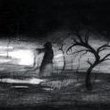
nrgrth Posted February 25, 2021 So, I've been playing Doom on console and decided to migrate to my notebook and try making some maps. This is actually my third map, but the two others were deleted before I actually finished them (I regret that). Without further ado, I decided to make something more like Doom 64, with dark ambients and some thinny hallways. I'm willing to make an episode with something around 8 to 10 maps, and this would be the first, so it's short and I didn't work too much on changing floor height, I'm currently working on the second map and I'm improving on that. If you could please check it and give me some advices. It's made for Brutal Doom and I used both Doom 1 and 2 textures, so open it with brutalv21.pk3 and both WADs, and it was tested in GZDoom and Zandronum. No jumping nor crouching, free look allowed, I don't recommend flashlight, but it's up to you, UV intended without fast monsters. map.rar 3 Share this post Link to post
nrgrth Posted February 25, 2021 (edited) There's a track alongside the map WAD, it's the track I intended to use in this map, if you want the full experience, play with it. Also, I thought about some lore for this and I'm trying my best to tell stories with the visuals of what happened before Doomguy got to this city, so every detail has some explanation for it and I'll include that after I finish the episode. Edited February 25, 2021 by nrgrth 0 Share this post Link to post
Spie812 Posted February 26, 2021 I'm going to keep this pretty concise, given that I'm not a huge Brutal Doom fan and the short length of the level. Requiring both Doom and Doom 2 wads loaded at startup is a bit screwy. It would be much better to just import the extra textures you need from doom.wad and only require the latter. The atmosphere is pretty spot on. Good use of dark areas, colored lights, and the like. Probably the highlight of the level for me. Level design is a bit flat and boxy as you mentioned, but the semi-realistic setting makes up for that a little bit. Combat is mostly serviceable. Good mixture of cramped areas at the start then more open areas later on. Enemy placement is fine, though the imps behind the trees in the final area can be a bit annoying to hit. The turret section is neat, though they could benefit from a bit more ammo to avoid having to switch between the two. The level's a bit light on ammo, but given the atmosphere I think that's a good thing. Overall, I think that this is a pretty good starting point for a longer set. The atmosphere and combat are fine by me, though I would definitely want to see a bit more variety in areas in future maps. 1 Share this post Link to post
nrgrth Posted February 26, 2021 11 hours ago, Spie812 said: I'm going to keep this pretty concise, given that I'm not a huge Brutal Doom fan and the short length of the level. Requiring both Doom and Doom 2 wads loaded at startup is a bit screwy. It would be much better to just import the extra textures you need from doom.wad and only require the latter. The atmosphere is pretty spot on. Good use of dark areas, colored lights, and the like. Probably the highlight of the level for me. Level design is a bit flat and boxy as you mentioned, but the semi-realistic setting makes up for that a little bit. Combat is mostly serviceable. Good mixture of cramped areas at the start then more open areas later on. Enemy placement is fine, though the imps behind the trees in the final area can be a bit annoying to hit. The turret section is neat, though they could benefit from a bit more ammo to avoid having to switch between the two. The level's a bit light on ammo, but given the atmosphere I think that's a good thing. Overall, I think that this is a pretty good starting point for a longer set. The atmosphere and combat are fine by me, though I would definitely want to see a bit more variety in areas in future maps. Thank you very much for the review! I'll import the textures as you mentioned, thank you! I'll probably cut off some of that imps behind the trees and some pinkies at the turrets (there are hell knights placed there only for multiplayer). I'm also trying to get low on ammo, heals and armor, I'm a fan of that resource management thing. As soon as I finish the second map, I'll post it too. I'm trying to change heights, but I believe everything, even little details like ammo placement, has to be explained somehow, so I'm thinking more about the lore here too. This level was more to set the pacing of the episode and served as a test for some mechanics that I'm still learning and improving. Thank you again, I appreciate your advices! 0 Share this post Link to post
DavidN Posted February 27, 2021 Thanks for submitting this as a test subject! Here are some thoughts and edits - including how to get the Doom 1 textures into a WAD intended to run on Doom 2: Like I say, I'm wary in these videos of making the map too much just like how I would make a map, but I think I found a couple of ways to alleviate the crampedness and flatness without taking too much away from your more realistic-looking setting. In mapping it's always a balance between realistic spaces (which aren't very fun to play in) and Doom-style spaces (which aren't very realistic). Here's the map after my changes! http://files.teamouse.net/doom/wads/edits/MAP02.wad 3 Share this post Link to post
nrgrth Posted February 27, 2021 1 hour ago, DavidN said: Thanks for submitting this as a test subject! Here are some thoughts and edits - including how to get the Doom 1 textures into a WAD intended to run on Doom 2: Like I say, I'm wary in these videos of making the map too much just like how I would make a map, but I think I found a couple of ways to alleviate the crampedness and flatness without taking too much away from your more realistic-looking setting. In mapping it's always a balance between realistic spaces (which aren't very fun to play in) and Doom-style spaces (which aren't very realistic). Here's the map after my changes! http://files.teamouse.net/doom/wads/edits/MAP02.wad Thank you very much! I really liked your changes and I'll definitely implement some of them. 1 Share this post Link to post
thelazyqdude Posted February 27, 2021 Played the wad with David's changes and Br00tal Dewm. Even though I'm not a fan of Brutal Doom, I am a fan of gameplay mods getting some very well-deserved maps to go with them. FOOTAGE: (will upload tomorrow & reply) Layout & Design: 6/10 Gameplay: 6/10. No highlights nor problems. Detailing: 5/10. Overall: 6.5/10. 0 Share this post Link to post
nrgrth Posted February 27, 2021 1 hour ago, thelazyqdude said: Played the wad with David's changes and Br00tal Dewm. Even though I'm not a fan of Brutal Doom, I am a fan of gameplay mods getting some very well-deserved maps to go with them. FOOTAGE: (will upload tomorrow & reply) Layout & Design: 6/10 Gameplay: 6/10. No highlights nor problems. Detailing: 5/10. Overall: 6.5/10. Thank you for taking your time! I'm making some changes myself and I'll upload here when I'm done, probably tomorrow. I made this map to just kind of set the pacing for the episode I'm planning, the demons will be gradually revealed, so I'm taking advices for the next levels! 0 Share this post Link to post
Lampenpam Posted February 27, 2021 (edited) I'm liking the atmosphere a lot. But try to make the place more interesting. I'm a fan of maps imitating realistic places but the layout was very much just straight running from A to B. Make the place more complex. Especially a school can have plenty of extra rooms to look through for supplies or is an opportunity to make paths split up. Some exploration and more vertical design would be a big improvement. And don't use spaces in the file name plz 1 Share this post Link to post
nrgrth Posted February 27, 2021 6 hours ago, Lampenpam said: I'm liking the atmosphere a lot. But try to make the place more interesting. I'm a fan of maps imitating realistic places but the layout was very much just straight running from A to B. Make the place more complex. Especially a school can have plenty of extra rooms to look through for supplies or is an opportunity to make paths split up. Some exploration and more vertical design would be a big improvement. And don't use spaces in the file name plz Thank you! This map is indeed very short and linear, it will be the first map of an episode I'm intending to make, so it was more to set the pacing and test some concepts, I'll for sure try to make bigger and non-linear maps for the rest of the episode. Again, thank you for the advices! 0 Share this post Link to post
HQDefault Posted February 27, 2021 Got some footage for ya, champ. Sadly when I recorded it I was using my laptop mic and OBS recorded Brutal Doom at FULL BLAST so it is literally impossible to hear what I'm saying most of the time. (Which really pisses me off because I specifically waited for a time where I could record narration, but I felt sending you a recording of my second playthrough would be less genuine) So instead, here are my comments: It's pretty strong for a first map. It's definitely a bit more claustrophobic than it needs to be, but your atmospheric touch is excellent. Reminded me of silent hill in a lot of ways, and combo-ing it with Brutal Doom was actually pretty smart, because most of the monsters now have glowing eyes that you can see in the dark, giving you an excuse to using lighting much more sparingly. My main issue at the moment is just how basic the layout is, right now it's mostly just a series of rectangular rooms, one after the other, and it feels a lot like you have "room-corridor-room" syndrome. Basically there's not really anything in this map that's tying it together into feeling like one place. For your next map, I would definitely play around with creating a more interesting layout. Maybe start by creating some rooms with an atypical shape, make sure you have some height variation and some ledges, and see where you go from there. 2 Share this post Link to post
nrgrth Posted February 27, 2021 1 hour ago, HQDefault said: Got some footage for ya, champ. Sadly when I recorded it I was using my laptop mic and OBS recorded Brutal Doom at FULL BLAST so it is literally impossible to hear what I'm saying most of the time. (Which really pisses me off because I specifically waited for a time where I could record narration, but I felt sending you a recording of my second playthrough would be less genuine) So instead, here are my comments: It's pretty strong for a first map. It's definitely a bit more claustrophobic than it needs to be, but your atmospheric touch is excellent. Reminded me of silent hill in a lot of ways, and combo-ing it with Brutal Doom was actually pretty smart, because most of the monsters now have glowing eyes that you can see in the dark, giving you an excuse to using lighting much more sparingly. My main issue at the moment is just how basic the layout is, right now it's mostly just a series of rectangular rooms, one after the other, and it feels a lot like you have "room-corridor-room" syndrome. Basically there's not really anything in this map that's tying it together into feeling like one place. For your next map, I would definitely play around with creating a more interesting layout. Maybe start by creating some rooms with an atypical shape, make sure you have some height variation and some ledges, and see where you go from there. Thank you very much, your advices are highly appreciated! I'll for sure work on improving the layouts and heights variation, next maps will also be bigger, so I'll have a little more space to work on that. 0 Share this post Link to post