id.dav Posted June 17, 2015 I do however believe that Hugo Martin is great at designing a high-tech stuff, Jagers were awesome. Some environmental UAC stuff could be his work as well...weapons probably...but he should've avoided touching demon design! 0 Share this post Link to post
Shapeless Posted June 17, 2015 I'm not feeling the mancubus particularly the head which looks like half-life's snarks the imps and hell knights look like Kenneth Scott's concept art for doom 3. 0 Share this post Link to post
Kaskaum Posted June 17, 2015 Shapeless said:I'm not feeling the mancubus particularly the head which looks like half-life's snarks the imps and hell knights look like Kenneth Scott's concept art for doom 3. A much better mancubus: I also didn't like the face of the mancubus, looks like some mix between cacodemon and HL stuff. 0 Share this post Link to post
Deleted_Account Posted June 17, 2015 Nah, I prefer the Doom 4 Mancubus over that picture. 0 Share this post Link to post
gaspe Posted June 17, 2015 I can say I am a bit disappointed of the overall art style. I was expecting something a little more characterized, but the work they done looks very consistent. I actually liked some things, but overall it was... meh. 0 Share this post Link to post
Fulgrim Posted June 17, 2015 Only design that I can't stand is the Cyberdemon. It look like it came right out of the Darksiders games with a bit more detail added. The Mancubus also has the same vibe due to its head. But, it's not as bad. 0 Share this post Link to post
Job Posted June 18, 2015 Kaskaum said:A much better mancubus: I also didn't like the face of the mancubus, looks like some mix between cacodemon and HL stuff. http://orig14.deviantart.net/1e5f/f/2013/053/d/9/let_s_do_doom_pt_13___mancubus_by_mechanubis-d5vszow.jpgAlways loved this interpretation of the mancubus. Wish they went more this route. 0 Share this post Link to post
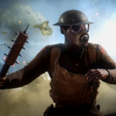
SirKicksalot Posted June 18, 2015 They look like plastic toys. The whole footage had a weird plastic look IMO. I like it. 0 Share this post Link to post
TheUltimateDoomer666 Posted June 18, 2015 I like the new Mancubus and Cacodemon. But the Cyberdemon...one of my favorite DOOM monsters...it's a betrayal! I liked DOOM 3's Cyberdemon remake; it had a nice new appearance while still being a missile-launching skyscraper with goat legs. The new Cyberdemon looks like a living tree trunk. An ugly living tree trunk, and ugly in a bad way. It has too many eyes, its teeth are too big, and it has asymmetrical antlers. I hate the asymmetrical antlers. Maybe I dislike it because it's just too different from the original, and it might actually be an okay design when judged on its own. 0 Share this post Link to post
Kaskaum Posted June 18, 2015 TheUltimateDoomer666 said:I like the new Mancubus and Cacodemon. But the Cyberdemon...one of my favorite DOOM monsters...it's a betrayal! I liked DOOM 3's Cyberdemon remake; it had a nice new appearance while still being a missile-launching skyscraper with goat legs. The new Cyberdemon looks like a living tree trunk. An ugly living tree trunk, and ugly in a bad way. It has too many eyes, its teeth are too big, and it has asymmetrical antlers. I hate the asymmetrical antlers. Maybe I dislike it because it's just too different from the original, and it might actually be an okay design when judged on its own. Agree, they shold have gone more to this route with some fix on the face-mouth-teeh and eyes: 0 Share this post Link to post
dsm Posted June 18, 2015 Kaskaum said:A much better mancubus: I also didn't like the face of the mancubus, looks like some mix between cacodemon and HL stuff. http://orig14.deviantart.net/1e5f/f/2013/053/d/9/let_s_do_doom_pt_13___mancubus_by_mechanubis-d5vszow.jpg As awesome looking at that piece of art is, and I do like it a lot better than the Doom 3 Mancubus, it still looks too much like a mutated fat Human for my taste (and there are already a lot of Doom monsters that give off that "mutated Human" vibe as it is). The new one looks like a whole different beast and I particularly like the dark and sort of organic look to its armour and flamethrowers, which gives it a very hellish feel.I'm not feeling the mancubus particularly the head which looks like half-life's snarks I do not consider that a bad thing, because Snarks aren't fat, somewhat humanoid blobs with flamethrower hands and I don't mind that artists draw inspiration from other sources. 0 Share this post Link to post
Kontra Kommando Posted June 18, 2015 Piper Maru said:Well, what do you want us to do about it? Classic Doom Monster Model pack. Somebody get started on that mod please; at least for select monsters (I vote for former humans) I think the imps are pretty good. But I would have like to see them be more humanoid as they were in the classic dooms. Making them more quasi-human, and less animalistic and agile would make them sort of creepier IMO. 0 Share this post Link to post
DooM_RO Posted June 18, 2015 Kontra Kommando said:Classic Doom Monster Model pack. Somebody get started on that mod please; at least for select monsters. There is a guy who also made Doom 64 and Quake models for Doom 3. Maybe he can also adapt them for Doom 4. That would be amazing. 0 Share this post Link to post
Kontra Kommando Posted June 18, 2015 I think even the demon would look bad ass if they tried to recreate it to be nearly anatomically correct to the classic games. It would sort of have a face like that hallway monster from hellraiser. Remaking the monsters to be nearly exact to the orignals, but adding a disturbing realism would have been amazing. Sort of like in Ren & Stimpy; where it would go from a simple drawing, to an overly-detailed and disturbing close up. 0 Share this post Link to post
Tetzlaff Posted June 18, 2015 DooM_RO said:There is a guy who also made Doom 64 and Quake models for Doom 3. I only know the Quake models (from the Shambler's Castle mod), but Doom 64 models for Doom 3? Do you have a link? 0 Share this post Link to post
Olroda Posted June 18, 2015 While I have no link for the above, here is another guy's project, which looks ace. On DooMworld, no less! 0 Share this post Link to post
Tetzlaff Posted June 18, 2015 Olroda said:While I have no link for the above, here is another guy's project, which looks ace. On DooMworld, no less! Technically he does a good job but IMO the cartoony sprites transformed into detailed 3D models just look ridiculous. It surely is nostalgic, but no style. I' m glad the new Doom doesn't go too far in that direction. 0 Share this post Link to post
Clonehunter Posted June 18, 2015 Obviously in the minority I think, but I really like the new Cyberdemon. 0 Share this post Link to post
Deleted_Account Posted June 18, 2015 Clonehunter said:Obviously in the minority I think, but I really like the new Cyberdemon. I dig the new Cyberdemon. Give it time, I'm sure more people here will accept it. 0 Share this post Link to post
LANEGRACABRA Posted June 18, 2015 I like the new Cyb too mainly because I watched the CGI trailer so many times in 2014. 0 Share this post Link to post
DooM_RO Posted June 18, 2015 So far the Revenant and the Caco are the most successful renditions and arguably superior to the originals. The Hell Knight is not too bad either. 0 Share this post Link to post
Antroid Posted June 18, 2015 Kaskaum said:A much better mancubus: Lose the obligatory decorative orange lights and it's pretty much a perfect mancubus design for me. I don't mind the new one, though (I only wish his armor didn't look quite so sleek and futuristic). That cyberdemon is also creepy and badass. The new one is complete garbage. I feel like I mentioned it before... 0 Share this post Link to post
Lycaon Posted June 18, 2015 Of course they suck, every visual detail in that gameplay showcase sucks 0 Share this post Link to post
Jaxxoon R Posted June 18, 2015 I don't know, the font looked pretty cool. 0 Share this post Link to post
Koko Ricky Posted June 18, 2015 I've now seen complaints about the futuristic detailing on both enemies and weapons. What the fuck, guys? The weapons and enemies in Doom have always been futuristic, to an extent. It's just that, in 1994, the cyberpunk aesthetic was different than it is now, not to mention, those guys were all young, probably in their 20s, and had a frequently less mature (and more goofy) artistic approach. 0 Share this post Link to post
Koko Ricky Posted June 18, 2015 Kontra Kommando said:http://i.imgur.com/yQb75m2.png I think even the demon would look bad ass if they tried to recreate it to be nearly anatomically correct to the classic games. It would sort of have a face like that hallway monster from hellraiser. Remaking the monsters to be nearly exact to the orignals, but adding a disturbing realism would have been amazing. Sort of like in Ren & Stimpy; where it would go from a simple drawing, to an overly-detailed and disturbing close up. This is hard for me wrap my brain around. You can't make them realistic because the proportions are too nutty. Look at the humans/zombies, for instance. Average human head is about 1/7 of their body's height if you're an adult; it's closer to a toddler's proportions in Doom because of pixel limits. And you want that translated to realistic next gen graphics? You can add as many normal maps and polygons as you want, it won't be "realistic" except for the lighting and texturing. The actual model would still look cartoony. And the R&S example is kind of poor, because they use completely different aesthetic approaches for close-ups versus full body shots. 3D games don't work like that. If you want the enemies to be reinterpreted to look realistic, they can't resemble the originals too closely without getting into goofy territory. 0 Share this post Link to post
Zemini Posted June 18, 2015 The only one I don't care for is the Cyberdemon. He looks like he really let him self go. So far I love everything else. However did the Strogg join or get enslaved by the Demons? One of the monsters looks very "Stroggish" 0 Share this post Link to post
Koko Ricky Posted June 18, 2015 There are aspects of the cyberdemon I like. It seems more like some weird rock creature now, which is cool, but something about the face...I dunno. RPGish? It doesn't look scary. The original cyberdemon looks fucking scary. 0 Share this post Link to post