Voros Posted September 21, 2016 I found the current title screen to be boring. So I took a screenshot of a game with bots with a map from Swift Death. Compare: https://github.com/freedoom/freedoom/blob/master/graphics/captainw/fdmtitle.gif?raw=1 Some minor edits might be required. But it looks pretty good ingame. What do you think? Now the Q/A Q: but that's Swift Death, not FreeDM! A: its MY SCREENSHOT of a PORTION of a Swift Death map. Its only meant to depict awesome DM. I find it to be a bad idea when a part of the game is shown in the title screen. 0 Share this post Link to post
Xindage Posted September 21, 2016 Well we dont need to be exactly a map of freedm be apeared in the title screen but a random map of another project make you think "where's that map of i cant find there", maybe we can think in something more generic... 0 Share this post Link to post
Voros Posted September 21, 2016 IMO, title screens don't have to match with the game that much. Just the main purpose (DM in this case). Mix that with awesome scenery (the Swift Death map here) and you get something very nice and appealing. The current title screen is generic really (just Fdoomguy in the middle of a techbase room). This possible new one shows actual fighting, a weapon, some health pickups, a sky and an interesting map architecture. There's a lot of red, which is the color the brain recognises first, and is the favourite color of a majority of society. 0 Share this post Link to post
Xindage Posted September 21, 2016 Voros said:There's a lot of red, which is the color the brain recognises first, and is the favourite color of a majority of society. <off topic> I dont like red... the actual colors of call my attentions is green mixed whit cyan and light blue and while playing i like use orange, black and green is my fav colors ^^ <back to topic> Well the new screen looks nice for now, the actual also is a outdated map of freedm, so i dont see any poblem on use it also as you say it show lots of freedm stuffs, including the fight. 0 Share this post Link to post
Dragonfly Posted September 21, 2016 FWIW, I feel that if you're going to go down the route of "No need to use an in game screenshot of FreeDM" you're better off not using an in-game screenshot altogether. 0 Share this post Link to post
Voros Posted September 21, 2016 Increased logo size. And if you guys believe the title screen should include one FreeDM's levels, than fine. 0 Share this post Link to post
MrFlibble Posted September 28, 2016 Voros said:Map17 of FreeDM. Better? Actually I like this one, it shows some action, and at a good angle IMO. 0 Share this post Link to post
Blastfrog Posted September 28, 2016 I actually quite like the original shot. Perhaps it could be painted over to look less like a screenshot. Voros, you wouldn't happen to have a higher res version, would you? 0 Share this post Link to post
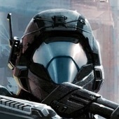
Voros Posted September 29, 2016 Blastfrog said:Voros, you wouldn't happen to have a higher res version, would you? YEAH...I ignorantly deleted the source image of the SW titlepic... But it could be hidden away in the cache. I'll look into that. <edit> I remembered I keep backups. The source image is right here. It's not HD though. 0 Share this post Link to post
Blastfrog Posted September 29, 2016 Voros said:I remembered I keep backups. The source image is right here. It's not HD though.Mind posting it? Doesn't matter if it's not HD, as long as it's higher res than 320x200. 0 Share this post Link to post
Voros Posted October 1, 2016 Sorry for the delay, but here it is (the source): http://i.imgur.com/aQiIPDn.jpg 0 Share this post Link to post
Voros Posted October 15, 2016 Victory2: Endpic: Fdm1 Fdm2 Its worth noting that ingame both fdm1 and fdm2's plasma projectiles turned white :/ But victory2 and endpic are great. 0 Share this post Link to post
Catoptromancy Posted October 15, 2016 I think I would rather a logo with a more polished style. Freedoom always felt like it should be grittier monster fighter, while freedm was more polished in style and futuristic. Similar to comparing Quake3 and Warsow. Logo still looks good and fits to freedoom's theme. 0 Share this post Link to post
Voros Posted October 15, 2016 I'm not exactly sure what you mean Cato. Isn't the logo of Freedoom based on FreeDM's logo style? Here's a preview wad: http://s000.tinyupload.com/index.php?file_id=76539360252982486052 Why that blue plasma turned white, remains a mystery. 0 Share this post Link to post