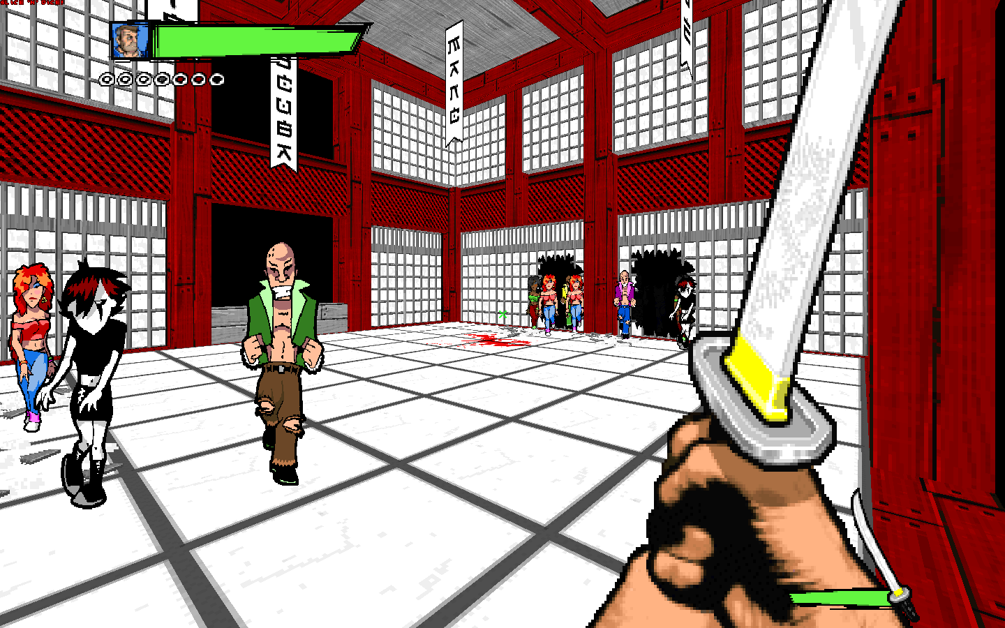
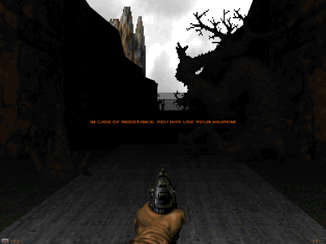
A nifty little shot from the Hellcore project. Remember, send in those Doom pics!
ViperBoy Posted September 17, 2001 Reminds me of Duke3d a little.... 0 Share this comment Link to comment
doomsick Posted September 17, 2001 boy, do i love seeing blood on the wall 0 Share this comment Link to comment
AirRaid Posted September 17, 2001 Not bad..... Not bad at all..... 0 Share this comment Link to comment
Swedish Fish Posted September 17, 2001 I like the floor texture. The big fan seems a little corny, but I think thats just my personal preference. Don't forget to variate floor heights with different levels...it could make this are more interesting. 0 Share this comment Link to comment
Guest EvilFuse Posted September 17, 2001 It's a preliminary picture. That screenshot itself is actually a few years old. I'm in the process of finishing that map right now, and i'm pretty sure it will be interesting, no worries ;). The floor texture was drawn by me, as well as the blood splat, although most of the textures in Hellcore will be Vanilla Doom/Doom2. Thanks for the compliments guys, i'm looking forward to finishing it. http://cdg.hotcut.com/Hellcore 0 Share this comment Link to comment
inferno_45 Posted September 18, 2001 Isn't that the bloodsplay from Duke Nukem? You know, the level where your on the movie set? I'm pretty sure thats when that came from, you THEIF! lol. I'm not totally sure though, I'd have to get a better look at it. 0 Share this comment Link to comment
Julian Posted September 18, 2001 "I'd have to get a better look at it." Instead of posting? :P 0 Share this comment Link to comment
Guest demoness Posted September 18, 2001 Where are all the badasses? 0 Share this comment Link to comment
Hyena Posted September 18, 2001 The shot does look cool and well detailed . . . but it doesn't look scary. But then it is a preliminary. I can think of tons of ways to make that little room scarier. 0 Share this comment Link to comment
Guest EvilFuse Posted September 18, 2001 Well, the imagine has been artificially brightened.. in game it's not nearly as bright and has a much 'scarier' atmosphere. 0 Share this comment Link to comment
Guest EvilFuse Posted September 18, 2001 err image.. gg 3:00 am :/ 0 Share this comment Link to comment
Guest Transon Posted September 18, 2001 The floor looks so... flat? I'd have put something higher or lower at the centre of the room. Maybe lower. 0 Share this comment Link to comment
Guest Pornoqueen Posted September 18, 2001 hey it looks really cool !!! 0 Share this comment Link to comment
YicklePigeon Posted September 18, 2001 So when can those who have been working on this project (like me) play these wondrous levels? 0 Share this comment Link to comment
Law Posted September 18, 2001 I hear all the time, and here, about hight varances in a level. What if you are trying to make a realistic building, like in the picture above. Its just I never see raised platforms in the middle of an office, a street or shop. So how do you get away with it while keeping the look realistic? I just need adivce for what I'm making. 0 Share this comment Link to comment
Linguica Posted September 18, 2001 Mostly it's just that a big unbroken stretch of ground looks kind of ugly in Doom. You can try splitting it up with different floor textures, or minor height differences of 4 or 8 units -- nothing too drastic, but it'll still break up the monotony of a big empty floorspace. 0 Share this comment Link to comment
Russell Posted September 18, 2001 if you must have a flat floor I find that putting some sort of 'skirting board' around the edge of the room sometimes improves the appearence (i used this idea in a few rooms in Tunnel Run). Of course, aligning wall textures well also helps and doesn't make the lack of detail in other aspects detract from the overall appearance (IMHO). and talking about alignment.....Just my opinion, but the two far walls in the shot need attention. I can see what the author has tried to achieve on the far right wall, but the resulting alignment of the textures conflicts too much with the same texture on the far left wall. nice shot though, i love the fan. ....maybe i'll shut up :-) 0 Share this comment Link to comment
Law Posted September 19, 2001 thanks, that just got a few ideas going. 0 Share this comment Link to comment
Guest demoness Posted September 19, 2001 That big fan does look kinda corny, but without it, the room would look even duller. 0 Share this comment Link to comment
Guest EvilFuse Posted September 19, 2001 Thanks for all the feedback people. In my opinion, the room is far from dull though. I think most of the criticism is due to the fact that the room is nearly fullbright and the angle of the screenshot. (The screenshot was artificially brightened, making it look a bit duller.) The fan looks far better in the dark, hence the black textures that you’re not normally able to see… Anyway, i've noted all your comments, and since i only started working on this map again a few days ago, i'll look into it. Oh one more thing, please note that this level was made in early 1998 and isn't on the same level of detail as most maps today (This screenshot is how the level looked in 1998 taken recently with Gl-Legacy). I plan to add a bit more detail, but nothing too revolutionary or groundbreaking; the gameplay in Hellcore truly makes up for this though… Russell, thanks for pointing out the textures, but like i said before, this is in progress and i haven't thoroughly looked for bad offsets. 0 Share this comment Link to comment
Lüt Posted September 19, 2001 What's with ripping on that fan? It's the only piece of non-standard architecture that stands out to me. Looks cool. 0 Share this comment Link to comment
Vorpal Posted September 20, 2001 that screenshot isn't too hot, the actual room is much better. 0 Share this comment Link to comment
YicklePigeon Posted September 20, 2001 The fan does look good, I mean, what do you expect? Unreal 1 style fans?! Sheesh. Be grateful already. 0 Share this comment Link to comment
Guest EvilFuse Posted September 20, 2001 i tried adding more detail to it this morning, it ended up looking worse every way i tried... That screenshot was taken with 100+ fov, so the room looks a lot more open than it actually is. 0 Share this comment Link to comment
Guest Nemesis++ Posted September 22, 2001 Cheez,I accidentally came across this site and when I saw the pic of the day,I couldn't believe my eyes...A pic from Doom,a game that's such a retarded shit!!!There's almost no one who still plays that old,sickmaking game.6 years ago,I amused myself with it but nowadays it's old crap!!!Get a life,make levels for other game's like Max Payne or Quake III.Doom is retarded,let it rest in peace! 0 Share this comment Link to comment
Guest EvilFuse Posted September 23, 2001 Why bother posting here if you have no interest in doom? 0 Share this comment Link to comment
Law Posted September 23, 2001 and why make an account on Doomworld. Truly you are the retarded. 0 Share this comment Link to comment
Guest demoness Posted September 23, 2001 Max Payne and all that other shit focuses on graphics, not fucking gameplay. doom fucking revolutionized gaming. it set fucking standards for those game that your playing now. What the fuck do you mean you amused yourself with it? It fucking amazed you. you know it did. Your full of shit. I'd like to see [bYOU[/b] and your faggot ass make a 30 level conversion for one of those shitty game you play, bitch. fuck you. 0 Share this comment Link to comment
Recommended Comments
Create an account or sign in to comment
You need to be a member in order to leave a comment
Create an account
Sign up for a new account in our community. It's easy!
Register a new accountSign in
Already have an account? Sign in here.
Sign In Now