Jump to content
Search In
  • More options...
Find results that contain...
Find results in...
  • Sign in to follow this  

    Sudden Death Released


    Mordeth

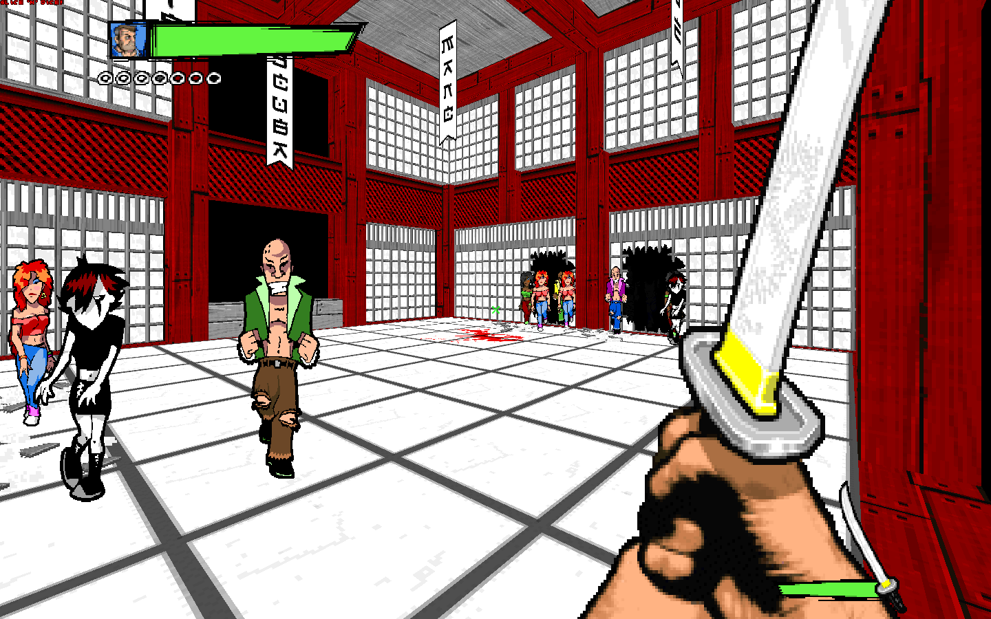
    King REoL has released his Sudden Death level at his site, to mark its sixth birthday. He also announces a new project called "DeatH FesT 2000" featuring a "new format of gameplay" similar to "Death FesT '95".

    Sign in to follow this  


    User Feedback

    Recommended Comments

    Guest citrus

    Posted

    Wow, that was an awful waste of time. Bad lighting (255 in most outdoor areas.. ugh), tremendously stupid puzzles, horrible use of BOOM effects (fall into some deep lava and you'll understand), way too much ammo everywhere, almost nothing but 90 degree angles everywhere, most areas are very under-detailed, horrible choice of ceiling flats almost everywhere and the monster placement was a joke. There was one area that looked nice, but thats it.

    Share this comment


    Link to comment

    The level wasn't too bad. It had some areas that were very ugly (like the computer lab places, and that big metal sewer ugly thing), but some were nice looking (most of the METAL2 and TEKGREN stuff). The gameplay was okay, though a lot of it seemed to be "mow down these guys and most on". That step puzzle thing was pretty cool. If I had to give it a rating, it'd probably be 7/10 or thereabouts.

    Share this comment


    Link to comment

    1. 255 light levels -no problem: At least I can see.
    2. Tremendously stupid puzzles -no problem: At least they weren't
    frustrating. I just solved them and moved on.
    3. Horrible use of Boom effects -heh, looks like he forgot to use
    a colormap. Dumb I agree but not fatal to gameplay. Besides
    I didn't notice because I didn't fall into the lava.
    4. Too much ammo everywhere -What a refreshing change of pace :),
    I absolutely have no problem with that.
    5. 90 degree angles everywhere -no problem: I use 'em all the time
    myself so I can't really be critical of someone else using them
    too.
    6. Most areas under-detailed -no problem: My computer didn't slow
    down playing this level. Besides, I've been critical of King REoL's
    maps in the past because of his use of too much detail, so I'd
    sound kinda dumb knocking him for cutting back.
    7. Horrible choice of ceiling flats -no problem: I didn't notice.
    I was too busy dealing with the rather stiff opposition :).
    8. There was one area that looked nice -try: there was one area
    that looked freakin' awesome! (The area around the exit)

    Overall I think this map is fun. It may not be very pretty in most places
    but it didn't bore me. It's a big violent level, and I kinda like it :).

    Share this comment


    Link to comment
    Guest Anonymous User

    Posted

    That had to be the most biased review I have ever seen. I am ashamed to be part of a community who shuns people who were/are very good at their work, even if I don't think it was the best thing I ever saw, either.

    Share this comment


    Link to comment

    biased? lut gave his unbiased review of this level and it just so happened he didn't like it. remember, lut is that extra-tough grader thing, so i'd translate that grade on the "normal" scale to about a 6/10.

    Share this comment


    Link to comment

    Remember also that Lut only gave Iikka Keränen's DM level 6.5 out of 10! Iikka certainly has been one of the most acclaimed members of this community. Lut is a hardass, but I don't think he is biased :).

    Share this comment


    Link to comment

    6.5/10 is about right, it looked good but lacked the pace and conectivity of the quake3 version. Needed more weapons too.

    Share this comment


    Link to comment
    Guest Anonymous User

    Posted

    I re-read it, and you may be right. When I first read that, I thought he was just another anit-reol person just to ruin another person's credibility, but if he's so hard-assed, I guess he was just honest. Where everything is horribly mis-alligned, I'd like him to point that stuff out, because outside a few 45-degree walls, everything looks good, allignment-wise.

    Share this comment


    Link to comment

    Allright... I don't know why everybody thinks that review is so biased. I stated exactly why I thought the level sucked. Please re-read and pay closer attention - but in short: anything that wasn't a 90-degree, 64 (or multiple thereof) pixel long wall was not aligned/offsetted or textured with what I would consider a 'proper' texture (Tekgren walls on 8-pixel lines for example), except for the X-Treme detail parts, some of which did look very good. But a nice arch doesn't up the map's overall score. The textures do not even come close to matching (brown/bronze on silver with tekgren and grey tile floors??). The lighting and monster/ammo/health placement was horrible. Ola said it best himself with the first post here.

    I don't review anything based on who made it. I didn't give Iikka's level an extra point for being an Iikka level and I didn't knock REoL's level for being a REoL level. Iikka's level was just pretty hallways. Since it is a deathmatch level the overall rating was strongly based on how well it played in deathmatch, which was not well.

    If I were ever to give a level a review of 10 (which I don't think I ever would) it would have to be perfect; in terms of the architecture, detail, use of special effects or new textures, storyline/plot, setting, and most importantly, mood. Full of decent surprises in each of those categories. That said, I guess if you want to translate my reviews to a 'normal' review, add 2 points to the overall.

    Anyways, you people will have your fair chance to rip on me when Millennium comes out. My maps are the 2nd-to-last four (the four maps before the final level.) To be honest I don't think I'd give most of them above an 8 anyways, but it should be interesting to see what other people think. I think they're pretty well-done, but that's just my point of view...

    Share this comment


    Link to comment

    Lut, actually only one person thought your review was biased, and I think I changed his mind with my post. I knew that you were going to be hard on it because I know what you expect from levels from your past reviews. Nearly everything you said about the appearance of the level can't really be disputed. You and Ola share the same priorities in level design. Others like myself and prower may value other things. I do think you were honest in your review though.

    Share this comment


    Link to comment
    Guest Fanatic

    Posted

    I must be missing something, I've looked over his entire site for 30 minutes and I can't find a link to the new map. Where the hell is it???

    Share this comment


    Link to comment

    Here you go
    http://members.aol.com/georgef551/Zipography/6fiffy5.zip
    Sorry I can't link you directly from this post but I know very little html :)

    Share this comment


    Link to comment

    I thought that level was a big improvement for king reol. Ola and Lut are in the same class as Matthew Dixon - a little too critical when reviewing. King reol, this is my 2 cents: Try and find the balance between the under-detail found in this level and the over-detail found in this level. I think it's important to remember though that he had a couple outdoor areas - which are hard to detail (IMO).

    Share this comment


    Link to comment

    Oops...I think in spans. More suggestions: Less linearity. Try and get those areas to run into each other more often. The level was too big. As for critiquing Millennium: Don't worry, we will -whenever it "never" comes out. I'm still waiting though.

    Share this comment


    Link to comment

    i had trouble finding it as well. REoL's site (i refuse to call him king) is so full of stupid jokes about the length of John Romeros hair that its almost impossible to find.

    Share this comment


    Link to comment
    Guest MrMGA

    Posted

    Hey, Lut, I like your reviews. Keep 'em coming. Ignore the critics and stick to your style. I used to write wad reviews myself. They aren't easy, are they? Some of the people on this board have trouble writing a coherent post let alone a detailed wad review.

    Share this comment


    Link to comment
    Guest Daggah

    Posted

    Too critical? Nah, he's not really all that tough. He seems to go ape-crap over my levels...proof that in all reality, he's too easy in reviewing. :)

    Share this comment


    Link to comment
    Guest Mattrim.

    Posted

    Leave me out of this, you bastards. =P

    Share this comment


    Link to comment


    Create an account or sign in to comment

    You need to be a member in order to leave a comment

    Create an account

    Sign up for a new account in our community. It's easy!

    Register a new account

    Sign in

    Already have an account? Sign in here.

    Sign In Now

×