


baja blast rd.
-
Content count
7366 -
Joined
-
Last visited
File Reviews posted by baja blast rd.
-
-
-
-
This reads as an early example of arcade-style mapping.
Areas are defined largely by color combinations, with no real overarching theme to the map: there are silver techbase rooms, brick-like Earth rooms, red hellish rooms, without much in the way of detailing or setting-building -- all centralized around a square hub room with key doors, which repopulates with monsters each time you find a key. It's on the simpler side visually, but still a very clear step above "monotextured square rooms"-type design, with some solid architecture, shapes, and texture combos here and there, and even a clever crushing UFO-like "ring" at one point.
The gameplay concepts are very straightforward, with one exception being a room that has you platforming over damaging floor while closets of lost souls and cacodemons open up. Instead, the bulk of the fighting is more often dished out as blocks of monsters often revealed in closets -- blocks at a density far below what you'd consider slaughter. Some of the potential fun involves herding monsters towards barrels; once I waited several seconds for chaingunners to walk halfway across the room, right next to a clump of barrels I could blow them all up with. The ending fight is designed for you to pour rockets into two static cybs while circling, and I skipped that one.
Completed in a bit under 10 minutes.
-
Waterworks excels at the all-important Start To Boat metric, which is how you know you are playing a good map. Flip around at the beginning and a snazzy motorboat is right there, with a comfy red chair. In its simplicity, it's a clever boat, a bit more creative than the simple wooden canoes that dominate in modern times. Marc Fontaine's telling us to step our game up.
That sort of creativity is Waterwork's MO. Just about every major room has some kind of creative trigger use that goes beyond "hit switch, remove simple abstract barrier in that room," such as a later part where you empty a drum of water to progress. And I don't know what the first map was to use a pair of screenshots as a camera display, but this 1996 map does it, aiding conveyance for a distant switch. The texturing is kind of janky but overall there is a colorful, varied look that keeps this 10-minute map from getting visually stale. Modern combat is of course nowhere to be found, but are you really looking for that here.
Ignore Memfis and find the megasphere secret, but use it to AFK against a zombieman.
-
A really brief mapset -- it took me around 15 minutes to play through, and the map with 42 monsters is the big one -- from Masayan, who contributed to JPCP. It feels like a My First Wad type of deal in its design choices and missteps. The first half "Uranus" has a creative theme. As this opening shot of map01 captures, it has a platforms-suspended-in-a-big-skybox theme that feels like if, say, Ozonia were made by a beginner, with very tiny maps, and patterned its visuals after Scythe and Kama Sutra (but sparser) -- or alternatively like a very simple, bite-sized version of lupinx-Kassman's design. It often looks and plays blandly, but I had fun rushing through it. Seems like it'd be good for speedrunning.
-
Funny, this plays on the e2m5 slot with the droning, edgy "Demons on the Prey," leads you off with an imposing metal fortress facade, and certainly continues with the overall floorplan of a squat fortress with all sorts of chambers and tunnels -- but, really…it's a My House map? The author itemizes its contents excitedly in the text file -- "bedrooms, bathrooms, showers, toilets, sinks, a billiard room, a pool complete with patio furniture, a library" -- and there seem to be a lot of clumsily oversized books, or folders (?). It's pretty amusing.
With 44 monsters and 7 secrets, the experience is more about exploration than combat. You're going to want to skip the two early cacodemons and the baron unless you like plinking away at beefy monsters while greatly underarmed. Doing that at least gives a way of using the BFG you get on something, which you'll otherwise get only after everything is dead. At first I pegged the secrets as an optional sidequest, but it turns out they are more or less mandatory -- the keys are in it -- which was a bit disappointing because I thought it'd be cool to have a contender for "first ever extensive BFG sidequest in a pwad." Keys in secrets can be a scary thought, but hunting everything down was easy. Obvious humping is greatly rewarded. Even by '94 standards, it's light in the action department, which is an issue mostly because you won't get to use all the loot on much, even with foresight.
-
Fun fact: the author of this could not have a Doomworld account. First, because he was 12 (you have to be 13 to have an account -- not even 12 and a half sorry), and second because in 1996 Doomworld did not exist.
For something made in 1996 by a 12-year-old, this is surprisingly good. It leads off with a vicious chaingunner-heavy ambush in a room that reminds me of a mini version of TNT's "Metal," which sets the stage for what is to come, a lot of fun, close-quarters, vicious traps that are still pretty "fair" because people are better at the game than they were back then. Some of the crossfire-heavy courtyards can simply be threshold-camped, but when a map rubs me the right way, I turn down that option. The texturing is competent and cohesive, heavy in Earthen tones like something out of early-mid Doom 2. Better than Master Levels.
-
This is a clever one, for a 1024x1024 contest from nearly 16 years ago.
It's obviously based on Entryway -- the opening for instance has a path behind you containing a chainsaw, and stairs in front of you along with some zombiemen -- but twisted into a 1024x1024 pretzel and quite aggressively reskinned. Since it's heavily reskinned, and infuses completely new concepts into the design, like a computer room with Doomcute computers and keyboards and mice taking the spot of the "armor room," playing is a fun little game of recognition of both old spaces and what thoughts might have led to the new look. Some playfully creepy music plays over the top.
The action is mostly what you'd expect from the slot, and hardly anything to write home about, but there is a revenant and baron and I had fun distracting the baron and then going to town with my chainsaw on its butt. The map does commit the 1024 layout sin of trying to cram six whole rooms into the playable cube, but the "mini version of some other map" pattern is an excusable place for that.
Baron ass out of 5.
-
On oddball from 1995, which makes it pretty normal actually.
Certain facets of this quickly hit me as unusual. The gameplay, even though it's largely insubstantial tussling with weaker monsters, has pretty good flow and kinetics for the time; coasting down the hallways feels buttery smooth. It's also a "non-linear" map where the exit is randomly off to the side in a secret-like alcove (very obvious, don't worry), so you can leave after engaging only a third of the already scant 31 monsters. And the look -- which is actually pretty and cohesive for something made in the days of DEU and EdMap -- stood out as a mix between a MyHouse wad and Entryway. It doesn't have obvious homages like the pointy staircase, but there are remnants of it in the (free) rocket launcher alcove, and one room with off-kilter 64x64 columns, and the general way areas are connected.
Then I read the text file and got all my answers: this is a DM map outfitted for singleplayer (more thoughtfully than most SP adaptations), and it also is trying to lightly ape Entryway.
A fun little old vignette and mystery to boot.
-
Do you like to hump?
Well this is the wad for you, at least at first. map01's progression involves wonky teleporters and keys stashed in secrets. While the next two maps depart from that, you should still be prepared to mash your soft parts into non-standard triggers.
The layouts consist of blocky rooms or spaghetti strands of hallways, with monsters dumped into these spaces more or less randomly, and it all gives off the impression of SLIGE after getting drunk (if computer programs could do that).
This old set does have its charms, though. The author outdoes SLIGE in the novelty of trigger use; map02 had a neat room where you press a "switch" to constantly raise the floor level of a large outdoor courtyard. The texturing can be funny at times: map01 dresses up a whole room in a key strip indicator, and then outdoes that by painting the next room in scrolling sky. (Yes that is a plus.) There is also fun to be had if you like blowing clumps of stuff up with barrels, the rocket launcher, or cell weapons -- albeit only a modest amount of that. Clocking in at around 10-15 minutes of play with carryovers, I would choose this for a speedrun-type blind race.
Note: 100% kills on map02 is impossible, as it contains a zombieman standing guard over the void space.
-
Proxima Centauri's hot start throws you headlong into what is quite enjoyable combat for the time, a small sandboxy city brawl with imps and pinkies and hell knights and revenants after you, mancubi around corners, pain elementals to take out, and lots of roaming and sniping zombies of every type. That is the highlight, and it's all graced with cheesy sound replacements and James Bond music. The '90s.
It's plain-looking by today's standards but has character, and there's a nifty hyper-dithered nebula sky replacement, although fans of Downtown (lol) won't get their verticality fix. The progression is charmingly incoherent. Lots of random illogical random teleports from one area to another, a lot of what feel like secrets but are actually unmarked … wait you use that key where again?
The major fault is that the puzzly exploration parts are very divorced from the action. It's easy to kill 95% of the monsters before making much actual progress, since most of them are roaming about and demand your attention. Then you end up with five minutes of teasing out what to do and where to go to exit, in silence, knowing you won't even get to use the extra "fake secret" resources you can find on much.
-
This is a riff on Computer Station that starts off unassuming, like a nondescript DTWID map with its uniform STAR* texturing and sparse, lower-tier opposition. But after a short while, it starts revealing that there is more to it.
The long vantages across its open spaces and the scattered opposition and the warped, jagged wall geometry result in a vibe of eerie desolation, especially when you spot monsters far away from you like ants, flickering momentarily in front of windows. In Memfis fashion, there is a recurring tasteful use of "sector gizmos": building stairs and falling platforms, and light pads that you need to step on to momentarily illuminate dark computer mazes. The design can be even more spare than Doom's, but what gives it a strong sense of place is the way areas are regimented visually into regions, with a convincing design logic uniting everything. Upstairs in the "computer station" region, there is a lot of STARTAN and STARGR, but this is surrounded, pretty much enveloped by an outer nukage-filled ring of grimier brown and green walls, which creates a neat structural-spatial effect. Exploration is more like taking a circuitous path through alternating habitats rather than traveling room to room to room. One of the big ideas inflecting that exploration is the use of radsuits essentially as keys, necessary for extended swims through nukage you aren't sure when will end, which spices up the light combat around it. I was reminded of Shotgun Symphony's desolation, although without that wad's immense scale, and certainly without its explosive rocket play. Controlled System goes more for a vibe of horror and dreariness, and doesn't try to match even Computer Station's intensity and use of packed monster closets.
The MIDI was not my favorite aspect of this -- it's kind of a droning, dull track, even though I see what the choice was going for -- but this was a solid 12-minute experience overall.
-
When I saw an oldschoolexual posted about this, I had to give it a go.
UNDERSEA.WAD is one of those pwads from the initial wave of 1994 that has been remembered by modern players because of its core concept, which shows that creativity ages best of all. That concept is that you're in an underwater base of some type -- although since the interiors tend to all feel similar to one another, lots of gray walls, lots of tight hallways, it's hard to pin the setting down much further. Combat is light apart from some occasional multidirectional exposure to hitscanners. Chainsaw fans might enjoy using the choppers on all the pinkies, cacos, and imps that fill the hallways or are packed into monster closets. It was surprisingly fun rampaging down the bends of a 64-wide maze with it in hand, just mowing down sergeants. There are some occasional satisfying barrel situations too. The early scrolling SP_FACE cube was amusing. (That texture has also aged well.)
Overall it just wasn't my thing, though: too much clearing out harmless monsters in hallways, and unlike some other wads from the period, like The Waterfront from a year later, there was not much to the concept. The rocket launcher and plasma rifle are in unmarked secrets that even the computer area map doesn't reveal because the lines are hidden from the automap, secrets that aren't hinted at with a changing wall texture, so without those I skipped the handful of barons. If I vibed a bit better with the map, I might have distracted them and chainsawed them in the ass.
-
I was not expecting much out of this 1995 map I searched out on a whim, but this was a fun ten-minute excursion.
It starts off unremarkable. You're touring a bland-looking, extremely brown-textured city block, playing shotgun peekaboo with zombies and imps through the building fronts.
But as the boat by the harbor and the lighthouse in the distance both suggest, this is less a map about visuals and combat and more one about exploration and, the author's true love, presenting clever, creative ideas. What really makes it is the use of "fake sprites" as NPCs and decoys. While playing, I interpreted it as a simulated battle in progress, but according to the text file, the map is "haunted by the ghosts of dead players, some of whom are still firing their guns." There was another gag later I won't spoil that got me. This was also one of the earliest wads to intentionally use the archvile ghost bug, as one of its major "gimmicks," although the threat level is low enough you have to sort of go along with it. Throughout there are plenty of amusingly janky ClipArt- tier custom textures, including one massively overscaled radiation sign that I laughed at. The custom textures are used to support the gimmicks, which include sector machinery that you can operate, albeit nothing overly sophisticated.
If it were much longer, I'd have started to feel the datedness of most everything but the creativity -- but it's short and sweet, so no big complaints. This would be a good candidate for a modern homage or remake.
-

973 out of 1012 stars
An all-time classic that is a shining model of how to seamlessly integrate gameplay, visuals, concept, music, and meme into a thoroughly enjoyable package that appeals to both experienced players and newcomers alike.
There is still clear room for improvement -- most stars were lost for failing to hit the McGeeism quota, and a few maps (especially the esselmap) called for a stewboy rearrangement of Toto's "Africa" -- so here is hoping the sequel is even better.
-
This is not the best ASS, and the experience can be bumpy, but I enjoyed how cheeky it is. It also lacks padding, which is only a bad thing if these puns are interpreted too literally.
Summary:
- reasonably idea-rich on a moment-to-moment level. the "nightmare sequence" theme was very good, and every author who used it interpreted it in some strange way.
- solid atmosphere and visuals (bathing everything in darkness does wonders for bare speedmapped visuals).
- gameplay has some unusual bits (punching stuff in the dark; going semi-pacifist at times when you don't have enough ammo to kill stuff or if you don't want to chainsaw lots of spectres). I liked those aspects, but they might be divisive.
- brief: with six very short maps, it was over before it outstayed its welcome.
- rough execution at times, as you'd expect from a two-hour speedmap session. also some softlocks in map01 (a coffin?! feels intended lol) and map03 (ZDoom-only lift).Nothing special but I enjoyed myself. The two people who gave the first three reviews were overly harsh; it's not that awful. :)


-


50 Shades of Graytall is a seemingly improbable success of a project that was born when Gez I believe jokingly suggested a texture theme composed of a pair of Doom 2's awkward misfits -- GRAYTALL and FIREBLU -- and a texture designed for basically one purpose (it's in the name): DOORTRAK. And then miraculously, Someone actually did it.
Naturally its restrictions would seem to consign it to the garbage bin, but it worked out very well, becoming a darling of the community (but not of livestreams).
Part of the reason 50 Shades of Gray worked so well visually was that despite the apparent memeiness of the theme, the chosen assets complemented each other quite snugly. GRAYTALL, with its obnoxious off-center red strip and that ugly arrow-like splotch, is tricky to get a handle on as a mapper, but with some
angereffort spent on alignment, it gives you pretty red borders, either around the original gray core or freestanding, with can be fit to planes of arbitrary width. FIREBLU is an eyesore embodied, but with its purple-blue scheme, it comports well with the red strip of GRAYTALL -- in big picture terms, it functions as a splash of color among the other two desaturated materials. DOORTRAK is a crime painted '90s style over vast surfaces, but over sleekly shaped smaller ones it's not so bad, and something about being the only dark texture means that eventually your mind starts to perceive it as shade and contrast itself, rather than "this ugly thing customarily used for doors."
Add a very pretty primary skybox -- all inky blue and pink-tinged splotches, all stars and comets and nebulas in a spacebound sky -- that is fittingly sort of a "serious" take on FIREBLU in spirit. Add each mapper's ability to choose one texture to use for floor and ceiling (usually ones that meshed with the texture theme in some way). In the end, the working materials were ultimately quite harmonious in their minimalism.
The project head Marcaek was also picky about what maps he accepted, sending rougher work back to the drawing board or in some cases serving up outright rejections (especially to work sent in batches by one particular person who likes to chuck lower-effort maps at every community project within earshot). That makes him kind of the bad guy, some might argue, but strict QC is often a necessary evil for ensuring quality with open submissions.
Handed all of these elements with few defined rules or instructions for making it all work, the varied cast of mappers (which, looking at the roster again, has a suspiciously high number of "big names") did their own thing, in different ways, which was the final element of the magic gluing it together.

The typical 50 Shades map is fairly short and to the point, almost as if motivated to end before your eyes started yelling about the overexposure to FIREBLU, but of course Mechadon threw a curveball by being himself, with a long odyssey that is honestly little different from his usual sprawling feat of relentlessly intertwining architecture and crazy interlocking angles, just with these textures instead. There are abstract little gameplay-oriented maps that focus on punchy, kinetic action in varying molds -- pistol-and-shotgun pecking early, a brief and hyperviolent BFG romp late, and every degree in between. Some mappers attempted to reach into other dimensions entirely, fashioning surrealistic art pieces that compensated for the narrow palette by concocting something out of nothing -- as with Dobu's exploiting negative space in the form of invisible sectors, and NoisyVelvet being, "Hey, HOMs are a texture too!" Of course there were crates. Contrasting the natural lean towards abstraction is a bit of stubbornly playful representation: castles, faces, giant stick figures crafted out of sectors.
In sum, it's good shit.

-
-
since this came out, the moon look has been explored with more ornament and grandeur to it. (examples are Valiant by the same author and the single level Man on the Moon by Yugiboy85.) it's easy to write off Lunatic as slightly dated, with its sparkly clean CC4-tex look feeling like a design relic of the time.
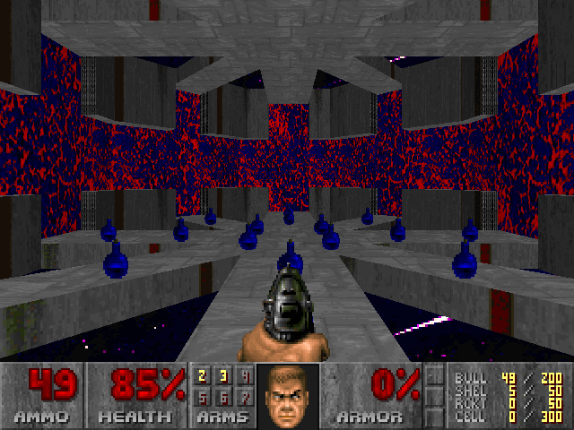
imo that would be a mistake. Lunatic has a great trick that the secret mysterious Doominati wants to charge you recurring payments of $19.99 for. throughout, there are a lot of cool, memorable "events" that I'd describe as cinematic. they are kind of like cutscenes, telling a ministory through motion and change, without of course stealing the controls away. their periodic appearances give Lunatic the vibe of a lived-in movie -- which, as an incidental bonus, meshes super snugly with the "action caper" pitch of the combat. "The Final Countdown" is basically a cinematic event from start to finish, along with being arguably the most iconic arena map ever and a preciously rare musical gimmick/pun map.
I think it's telling that Valiant's "Rocket Zone 2" would have been highly recognizable as a remake of Lunatic's "Rocket Zone" even if it had a completely different theme and gave the architecture a substantial overhaul. the sense of identity transcends the things that most commonly produce identity. combine that with essentially the perfect musical fit -- the cheesy, synthy jams of '90s arcade games and of course...that other one -- and a great skybox and props.
Lunatic's combat is defined by its unification of "challenge" and "fun" (not the way I classify things, but I've seen it often and it works here, so I'm rolling with it). basically, the parts where you plow down lots of fodder with powerful weapons -- in a way that might read as comic relief -- are also arranged to be the most dangerous fights, instead of serving as pure low-stress interludes. that danger comes from a wider range of powerful attacks (no surprise that both new monsters are zombies with hard-hitting non-hitscan attacks) and from the constant worry of the weakling mobs infiltrating your space. the result is a sort of hedging against either part not translating to a given player: if a fight is too easy to be exciting purely based on its threat-resolution arc or if it's frustratingly hard (not that the latter is likely in Lunatic), it can still redeem itself with raw components that are inherently satisfying.
skillsaw is also dogmatic about placing the needed parts of your progression goals in convenient sight -- a key might be hoisted on an unreachable platform, reached from somewhere else, with the matching key door adjoined in the same room. that both makes it hard to get lost and gives the action an undercurrent of psychological momentum. it is a pageturner in Doom format, in a way. having a clear picture of what's next encourages you to see it through, to tie the loose ends you've been handed. nothing's wrong with intentionally cryptic maps that refuse easy progress, but provided one wants super smooth flow, wads like Lunatic make a great study for avoiding the occasional hitches that often surface in maps that are 95% of the way there.
9/10 or so. improved on (nominally) but still indispensable.
/still not a reviewer. I don't do it often enough to count!
-

Finding out dannebubinga once made a KDITD replacement would be like finding out that Sgt. Mark has a cartoony TC for kids.
This essentially started as a "my first mapset" before danne found Sunder. For the genre, it isn't exceptional, but I enjoyed it.
-
This could ascend to Cacoward quality with a simple copy/paste clone job -- then it'd be Double Impact. *booed off stage*
It's an adequate "my first map." You chew up lumps of fodder with weaker weapons in small rooms with sharp directional lighting for about 2 minutes. One of the secrets was cool. Satisfying enough.
-
For a 13-year-old in 1995, these are phenomenal. (Unless we're getting LittleTempled here, but even if the author was really someone's 40-year-old dad named Bill, they still hold up as quite good for the time.)
e1m1-e1m3 is a trio heavy in KDITD homages that starts with a tiny concept map and then features two increasingly larger complexes that take a lot of design cues from maps like Toxin Refinery and Computer Station. The hallmark of the later maps is how sophisticated the layouts are; e1m3 is this tangling sprawl that felt like it had no boundaries, like there always another area when you got to the map's edge, yet was it easy and intuitive to navigate. e4m1 is a separate release bundled as a bonus. It's like Thy Flesh Consumed in the form of a spacious, bare castle courtyard. Good find.
-

An opaque '90s dungeon crawl map with kid's gloves on (meaning it's probably a good intro if you want to try that map out). Despite the really bizarre progression and more doors being unmarked walls than having actual door textures, I never got remotely lost because of the tight scale, the intuitive "try humping walls because otherwise I'm stuck" moments, and the automap pickup midway through. Lighting is really well done for the time, lots of darkness and even some directional work giving it a spooky mood. It starts out with a KDITD feel and then branches out to other themes, which feels like a very 1994 thing. The lateral thinking in figuring out how to get around was pretty engaging.
There will be high variance in how much people like this, and I'm not an expert on this era, but I enjoyed it.
-

The unsettling vibe is surprisingly thick. Feels like being in an unevenly lit old house as dusk falls with no one home, which, fair, approximates what it actually is. Except instead of "no one home," there are a few dozen bored tourists of the afterlife eager to chat you up about timeshares in Mt. Erebus. The backing music is an eerie-sounding subdued remix of Doom 1's victory track.
The layout is intricate and mazy, and you have to find keys and stock up on gear before having a sitdown with the landlord about all the paying patrons you shot up. She is pissed, likely to conduct the mediation not in English but in hails of bullets. The shooty aspects of the gameplay can be rough (these guys won't budge until finishing their ale) but I could forgive that.
I got an actual laugh out of this (spoiler), so 4/5.


SINTER v1.0
in s-u
Posted
Good map for chad players who don't get upset at deaths. Feels like if you took an easy modern shitposty puzzle-platforming map and decked it out in oldschool Doom chaotic texturing (like Monti) rather than a more modern texture spam style. Disconcerting teleporations, point-blank baron pairs vs. BFG, snaking awkward tunnels with nukage that will kill you if you don't have enough health, "weird machinery"-style multi-stage layout manipulation, bizarre unmarked teleporters, completionist trolling, unnecessary secret blursphere, platforming with height differences, fountains, barrel puzzles, "Tim" ... all in a 5-10 minute map. Return to monke.