fraggle Posted April 1, 2011 The Freedoom medikit sprites (including the stimpack and berserk pack) have a red cross emblem on their side. The red cross is a humanitarian symbol recognised by and protected under the Geneva convention. Laws in most countries restrict its use, and the Canadian Red Cross has actually spoken out against the use of the symbol in video games. Real medical kits don't actually use a red cross for the same reason. Suggestions for how to fix the problem:Remove the cross Change to a different color, eg. green Change to a different symbol, eg. a red 'H'Preemptive answers to potential objections: It's not a big deal Admittedly it's unlikely the project would be sued by the Red Cross; if they were to sue anyone then it would more likely be a commercial games company. However, the red cross is an internationally protected symbol and as I understand it, using it in this way may be illegal, at least in some countries. Doom did it / other games do it / it's the standard symbol for health in video games The fact that other games do it does not make it legal or legitimate. 0 Share this post Link to post
Quasar Posted April 1, 2011 Suggest the H option personally. Green is very un-health-like IMHO. Green is like poison, not healing. 0 Share this post Link to post
Catoptromancy Posted April 1, 2011 Ill swap around colors for now. But would be awesome in future to have a new set of these sprites. 0 Share this post Link to post
Mithran Denizen Posted April 1, 2011 Something in the vein of the 'pill' graphics ( ) used in the XBLA version of Doom 2 could work as well, so long as they aren't aped completely. Aside from that, I agree that a red 'H' would be the best option. 0 Share this post Link to post
CODOR Posted April 2, 2011 Put a white cross on a red background and claim that Freedoom's medikits are made in Switzerland... (More seriously: hospitals -- at least around here in Ontario -- are noted by road signs with a white "H" on a blue background. At least to me that would indicate something used to make one healthier.) 0 Share this post Link to post
Spleen Posted April 2, 2011 I like this symbol: http://www.lifesystems.co.uk/imgs/first_aid_kits/travel_first_aid_kits/Travel-Medical-Pack-M1.jpg A white cross on a red background, with a white border directly around the cross, to avoid confusion with Switzerland. 0 Share this post Link to post
PRIMEVAL Posted April 2, 2011 A heart maybe? Though the red H is pretty good. Or we could use a red upside-down crucifix >:-] 0 Share this post Link to post
Gez Posted April 2, 2011 fraggle said:Preemptive answers to potential objections: It's not a big deal Admittedly it's unlikely the project would be sued by the Red Cross; if they were to sue anyone then it would more likely be a commercial games company. However, the red cross is an internationally protected symbol and as I understand it, using it in this way may be illegal, at least in some countries. Doom did it / other games do it / it's the standard symbol for health in video games The fact that other games do it does not make it legal or legitimate. I don't see "is this an April's Fool joke" in the list of objections. Anyway, the GIS for "real medikits" above give me plenty of medikits with... a white cross on a red background. In my neck of the woods, a green cross is also the constant symbol for pharmacies/drug stores. Ambulance companies generally use a blue cross or a blue six-branch stars (similar to the star of life but without the Asclepius rod). The Rx or mortar and pestle could work too. Though at the scale we're talking about, the green cross or Rx would be the most appropriate. 0 Share this post Link to post
Blastfrog Posted April 2, 2011 I vote for a red 'H' as a replacement. And my own personal opinion on this matter, who really GIVES A SHIT? :| It bugs me to see people bend over to this retarded rule, especially considering it's standard in games, and that no one's really gonna sue. Not that my words will change anything, but whatever. EDIT years later: Oh, god, I'm cringing so hard. My tone in the above post is abhorrent. Whoever reads this post, please understand that I'm not at all like this anymore. 0 Share this post Link to post
Mithran Denizen Posted April 2, 2011 Well, if Freedoom is trying to fit the Free Software ideal, it's not really cool to be using an internationally protected symbol against the wishes of the Red Cross. I think fraggle's first rebuttal is applicable here. 0 Share this post Link to post
hex11 Posted April 2, 2011 You could always use a Heretic-style healing potion (well, similiar in style, not the exact sprite). 0 Share this post Link to post
DuckReconMajor Posted April 2, 2011 Sodahollic said:And my own personal opinion on this matter, who really GIVES A SHIT? :| It bugs me to see people bend over to this retarded rule, especially considering it's standard in games, and that no one's really gonna sue. Not that my words will change anything, but whatever. It's always nice to be able to say that something is completely legal to download and play. 0 Share this post Link to post
Z0k Posted April 2, 2011 potions or well for example: for 10 health point: Syringe and for 25 health point: a bunch of medicaments and bands dunno for the beserk. But for me green cross should work too. because people know too about the green cross. 0 Share this post Link to post
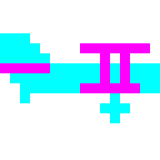
Blastfrog Posted April 3, 2011 Z0k said:potions or well for example: for 10 health point: Syringe and for 25 health point: a bunch of medicaments and bands No, no, and no. The graphic should not deviate from the original design intent. Medical supplies should stay the shapes they are, not showing other stuff like syringes and shit. Regarding the replacement, I say that color preservation is more important than keeping it a cross, for visual reasons. Maybe the berserk should have a B on it. Here's some graphics I just threw together: 0 Share this post Link to post
Catoptromancy Posted April 3, 2011 I like! Those look like they fit freedoom's style. 0 Share this post Link to post
Mithran Denizen Posted April 3, 2011 I agree, those are great. The 'B' on the Berserk is a nice touch. 0 Share this post Link to post
Blastfrog Posted April 3, 2011 Catoptromancy said:I like! Those look like they fit freedoom's style. Heh, probably cuz they ARE from FreeDoom, just modified. :P The berserk pack was actually based on the medikit, like id's version, unlike the existing berserk pack (it looks like placeholder shit, why it wasn't based on the medikit in the first place, I don't know) Don't credit me for my edit though, all I did was slightly modify the cross into an 'H'. Thanks for the comments, though. :) 0 Share this post Link to post
wesleyjohnson Posted April 5, 2011 Most of these games had to have a little paper book in them to explain what the shapes meant. The little symbols and shapes were too small to be distinguished by anything other than general shape and color. Even at higher resolutions the general player won't know if it is a red cross, H, or just a plain red square. Edit: I would suggest just a little red square on a white box. Or if a commercial medkit is intended, (as these are not really marine bases) then a white box with some red squiggle marks (meant to stand in for "Emergency Medical Kit") Or three little red squares on a white box, simple and distinct. It would not be too detailed for regular players to see, and would be distinguishable from everything else. Syringes and glass tubes just look wrong to be laying about loose, because the marines/corporation would never have med stuff that way. Strange colored "+" or H marks would no less confusing, but much harder to do because you are trying to imitate something accurately (and they probably will not be able to read it anyway). "H" means, this way to Hospital. It looks like a red square anyway. You could just a well make it a red "M" for Medical kit, or a red "E" for "Emergency Medical Kit", or just two red lines. Edit: After looking at them again, the larger could have the word "Medical" on it. The box could be stretched until it fits. The box appears to be larger than the original, but I think there is no size limit. If it was readable ... Being a white box is probably the feature that most identifies it as a medical kit. 0 Share this post Link to post
axdoomer Posted May 21, 2011 Why not a heart? And maybe a syringe on the berzerk pack. 1 Share this post Link to post
Archfile Posted May 22, 2011 Nice medikits/berserk! :D But try to put a fist in the berserk pack. Would make it look like a power pack. 1 Share this post Link to post
printz Posted May 22, 2011 axdoom1 said:Why not a heart?Because it makes Doom look too much like a console arcade platformer. 0 Share this post Link to post
fraggle Posted May 22, 2011 axdoom1 said:Why not a heart? Looks too much like the weighted companion cube from Portal. It might infringe on Valve's trademarks. (Joking) 1 Share this post Link to post
esselfortium Posted May 22, 2011 Nice edits, Sodaholic and axdoom1. I like the syringe symbol more than the "B". The H works well enough as a symbol for health, though. As for the hearts, they make me feel like I should be giving out Valentine's Day cards to imps. And we know what happens then. 0 Share this post Link to post
d1337r Posted May 22, 2011 I vote for a red plus sign. Since the medkit increases your health, that would be an obvious choice. Seriously, though, I'm for 1) a white cross on a red background 2) a heart 3) an H sign. Also, if one would really draw a nice fist for a berserker pack, then it would be possible to use the syringe on medkits. 0 Share this post Link to post
Blastfrog Posted May 22, 2011 @d1337r We can't use a red plus, that's exactly what we had to begin with. 1. Nah, medical supplies in Doom have always been white boxes with red symbols on them. For the sake of quick visual identification and familiarity, they should stay that way. 2. As Printz said, it's a little too cheesy for Doom. (yeah, I know Doom is cheesy, but a cartoon heart takes it too far) 3. I agree with this option. The reason I chose it when I made those edits was because it was very similar to a cros. (boxy, horizontal and vertical lines) But yes, I do like that syringe for the berserk pack. I vote for using that one instead of my berserk pack with a B. 0 Share this post Link to post
Mithran Denizen Posted May 22, 2011 That syringe looks more like either a plastic thumbtack or an arrow to me, but it's alright, I suppose. It probably looks more convincing in-game. 0 Share this post Link to post
axdoomer Posted May 23, 2011 d1337r said:Also, if one would really draw a nice fist for a berserker pack, then it would be possible to use the syringe on medkits. syringe on medkits: It's very hard to draw a fist because it's not possible to put a lot of details so it can be hard to see the fingers. 0 Share this post Link to post
axdoomer Posted May 23, 2011 fraggle said:Real medical kits don't actually use a red cross for the same reason. We could use a white cross like most of these medical kits. 1 Share this post Link to post
hex11 Posted May 23, 2011 The red heart is cute, but logical and easy to recognize, even at 320x200. You could also use a different sort of cross, like maybe a swastika (with arms bent counterclockwise, so it's not a nazi symbol). The syringe is an interesting idea, but at that resolution it looks more like a dagger or sword. How about a set of teeth (fangs)? A fist would ensure no end of jokes when used with imps. ;) To make the syringe more obvious, you could do away with the "pack" graphic entirely, and just have a floating vertical syringe sprite, sort of like how the healing potions were done in Heretic. 0 Share this post Link to post
Blastfrog Posted May 23, 2011 I think that we should stick to the original color scheme and shape, not turn it into something else or change any colors. It should stay a white box with a red symbol. Anyway, I actually like this idea of a fist on the berserk pack. I've taken the liberty of modifying axdoom1's graphic to look a little more detailed and stuff. 0 Share this post Link to post