How To Start Spriting Monsters
Hello, and welcome to Stopsignal's Small Spriting Seminar! Actually it's just an small guidance tutorial, i just liked the whole "Four S" thing. Anyways, i'm quite rambly, so from now on i'll try to keep it brief. (Future me: I actually kind of didn't. But i hope it helps anyways!)
Shameless self plug:
I thought it would be good to make a small post showing my process of how i do my sprites, so at least people can get the courage to make new sprite sets entirely from scratch, or at least edit existing ones! It feels great. Specially finishing the set. If you are thinking of trying it, just do it! PREPARATION. The most important thing in my opinion is to have a cool idea. Something you are hyped about. That one monster, that one creature, that idea that can't get away from your mind. It's the best place to start. In any case, if the result ends up kinda floppy, you can just edit it again some time later, i do it all the time! In this case, the idea i have is a monster called The Red Monkey. Trying to brainstorm monsters to draw one day my eyes wandered around in my room and i looked at this paint bucket thing:
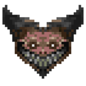
And that gave me an idea. Coupled with my love of pig noses and just general weirdness, i came up with this:
This is the red monkey. It didn't evolve much from there, thankfully. I'm quite used to falling in love with the first design i sketch, though i'm trying to move away from that. I thought of some variations, with guns, with crow feet, etc. But i just ended up liking the first design. Let's not stop there, however. You need to draw him some more times, in different poses. Just go wild. Cartoonize it. Play with the creature. Go drink something then go back to the drawing, and check if you still like it. A good design will stick in your mind.
All of this is important. You are checking how much you have the design in your mind, you are realizing if there are any flaws on it by drawing it on different poses, you are checking if you can even replicate the drawing again. It can happen that you can't! Maybe the creature only works in 2D, like mickey mouse's ears. You can work that in or change it, but it's good to start spriting knowing that ahead of time.
STEPS AND THINGS TO KNOW BEFORE GOING ALL IN TO DRAW
First, i'm using Photoshop here. (DISCLAIMER: You can use whatever you want. Some people even use Paint. SLADE can crop out background colors, so it's fine. Whatever you are comfotable with! I do say, i recommend programs that you feel comfortable with and that have layers and stuff. If they have stuff to help you with animation, that's better. I feel photoshop has it all for me, so i stick with it.) Second, if you probably don't have it, download SLADE. It's a neat program used to mod Doom. For this we will mostly use it to grab fresh sprites right from Doom.wad to use as style reference.
Open Doom2.wad with it. In the red square you'll see the filter option. Here you can search for sprites and stuff! Some good sprites to extract as reference are the Imp (TROO), the Baron (BOSS) and obviously, Doomnguy (PLAY). In the other square you'll see how to extract the ref image. Just right click, export image, export as PNG. You'll use this program later to add in the creature that we'll create in a wad. Also decorate. That's a bit of a different topic, but still ridiculously easy.
Drop all your reference images to a new image (make a new image, just in case, some editors get weird with palettes) in your program of choice.
Also remember that doom's monsters drop a few pixels under the terrain, so consider this when thinking of the size. Personally i dislike using Smart Sprite Adjustments and all of those because they break some animations, which is kinda sad but understandable.
First, draw the silhoutte of your monster. How you envision it.
This is really important:
-We need to get its size
-We need to get its normal pose
-We need to make a readable and easily identifiable shape and pose. Limbs separated if possible, make everything easy to see. RAMBLE ABOUT STUFF TO LISTEN TO (skippable)
I'll make the first pose i drew him on, more or less, so i'll go like this:
This is what i ended up with.
IMPORTANT NOTES
-It's REALLY important to have the different parts of the creature (head, torso, arms, etc) be easily identifiable with just a glance. I'm kind of in a pickly here with this creature having basically no neck, but i tried my best. Do all parts with different colors if possible. Having clashing colors in the same creature can help distinguish limbs apart (see the skin color compared to the fur) HOWEVER do not rely only on this.
Posing is important.
Shadows too.
-Usually you should start with the front or the side. Starting with the angle is, eh, complicating. I do like to do this one however because i get to see this guy's face earlier on (as it's an elongated, eyes on the sides face) and i like it that way.
Avoid this though! Making the diagonal side is way easier when you have the other two done.
PAINTING AND ALL THAT COMES WITH IT
Ok. Let's continue. It's time to start painting! This is the most daunting part, i know. It's ok, we are here together! I really don't think i am smart at all yet i can do this, so can you. Just takes a bit of practicing your aestethic sense.
Now. Important: Doom has a weird aestethic. Yes, they are sprites, but they are actually edited pictures. This is KEY as usually picture based sprites are more contrasted than normal, and don't have a common distribution of shading. The painting is more erratic and has no sense of being digital at all. It's weird.
So what do we do? Let's lay some ground rules:
-DO NOT USE THE BRUSH PLEASE. AT ALL. Brushes leave an uniform shading and you can't really control the colors at all. I mean, if you are good with this go ahead, but you'll lose control of your colors. You will have a harder time fixing the mistakes the brushes do than if you just place each pixel by hand, really! Talking from experience.
-You will do this wrong the first time. The shading of my characters usually evolves over the time i am drawing the sprite. Like at least five times per sprite. I even end up pillow shading a lot before i get to my senses (if you don't know what this is look it up, and AVOID IT LIKE THE PLAGUE). You'll probably need to take some time off the computer and come back to see your errors. It happens to me a lot!
-If you can, bind a key to flipping your canvas horizontally, and get used to pressing it constantly. Eyes aren't fair, usually your right eye is better than the left. By seeing the character flipped all the time you'll be able to fix errors you won't realize are there. -Don't worry about what colors to use. What is important is to have the shading right. We can change the colors in any time in production. (When i finish the sprites i tend to make a dummy actor in decorate, add the rotations to it and summon other monsters just to compare if the coloring is correct and goes well with doom. IT'S ALL SUBJECTIVE, but important) Now. I can't really teach you how to paint. But i'll give you some key points. 1-Usually you should paint everything without light or shadows like up there. Grab the pixel tool, choose the same color but brighter and add a new layer of light, or darker for shadows. If the contrast is too much, use 50% transparency to get the color inbetween the base and the new one, and so you'll have a new color to the palette. 2- BORDERS. Doom sprites have borders most of the time. They are really subtle and unnoticeable. They are most of the time the color that is adjacent to it, just a bit darker. Never brighter. Looks weird. Also if they are on a side with light, they are a bit lighter than usual, if dark, they are even darker. 3- ANTI ALIASING. I have a hard time explaining this as it's mostly perceptive. Basically try to soften your shapes with the palette you have. As much as possible. Also don't be shy with anti aliasing. A good test is to make the program resize the image to a ludicrous size, and give it a bilinear interpolation. The shapes should look smooth and she shading should look correct. Example:
I was too careful with the shading on the arm, and it does not look as good as a result. The shading on the shoulder is good, though!
4- ANTI ALIASING vs CONTRAST. Quite simple to grasp, kinda hard to do right. Basically, if you change from from dark to light or viceversa in not many pixels, then you are changing the shape, while if you are softening the light, then you are doing only one shape. I am really bad at explaining this! Let me show you instead:
In this you can see how the shapes of the face alone are aliased (well, as much as i could do with that few fixels) but the contrasts are the ones that actually make the shape of the face. I am so sorry about the horrible drawing though, my tablet's sensibility broke and i need to reset the PC to fix it and i'm not doing it.
5- Go BOLD. It might be hard, but sometimes you'll feel like you are getting stuck shading a part. Say fuck it, get a brighter/darker color, paint over most of the part that is bothering you, and try again. If you get stuck you won't get anywhere. Ditch that shading and start again, i swear, it's faster! Don't be afraid of moving parts around with the selection tool either. Try everything.
6- If in doubt, check the references. You'll never realize how sexy the back of the baron is until you see that sweet sweet shading. Oh man. Kidding aside, it's the best you can do. I am a firm advocate that aestethics are the most important thing of all, and if i'm doing sprites for Doom, i want them looking like they came straight out of Doom. It's hard, and i haven't reached that, but i try to get as close as i can each time! No 3D, no brushes, just straight pixel by pixel placing.
7-Have fun! If i remember anything more, i'll post here.
ENDING THOUGHTS (for now, still not finished)
Basically, just start. Seriously, that's the best advice i can give you.
It's fun, incredibly rewarding and you feel like you did something awesome at the end.
There will come a time after the inspiration wears off that it will be hard to continue, but just barrel through it, go on, because the end product is always exquisite. JUST FINISH IT. Then start another one. You'll be better and faster. And then another one. And so on.
I hope this inspires you and gets your creative juices flowing. Just start! If you have any doubts, ask me, i'm here. Sooner or later i'll continue this tutorial, as it's not finished: i want to add coloring and recoloring, and animating, which is the thing i love the most. I can even help with sounds and code!
We'll see. Maybe the tutorial becomes How To Make A New Doom Creature From Scratch, but for now it's this.
In any case you can check this video out: https://www.youtube.com/watch?v=O_hCjVVrwMY
It's me drawing an Abutor frame. Maybe you can see some more stuff i didn't say here, because, really, i don't think of all this stuff while drawing. With time you won't either, you'll just draw and this will come naturally.
It's just perception and willing to do something awesome!
One final treat: I'll leave you my first ever "doom style" sprite i made, just to compare:
I think we are going rather swimmingly, hahahah!
Don't do ultra dark contrasty sprites like me, hahahah
At least you can see that the process hasn't changed much. That was in 2014 i think. I was a wee lad! You can do better than me, so go and do it, hahahahah <3
-
Reputation Points
- 4 replies